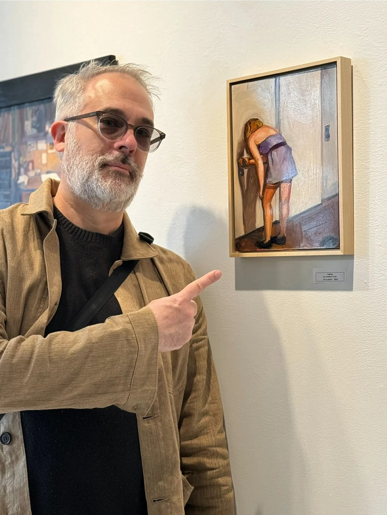
Two of my paintings – Pacific St. and Hallway – are a part of this month's "Interiors" exhibit over at Studio Gallery in San Francisco. The show runs until April 22. If you're in the area and need a fresh fix of some good art, you should check out this show.
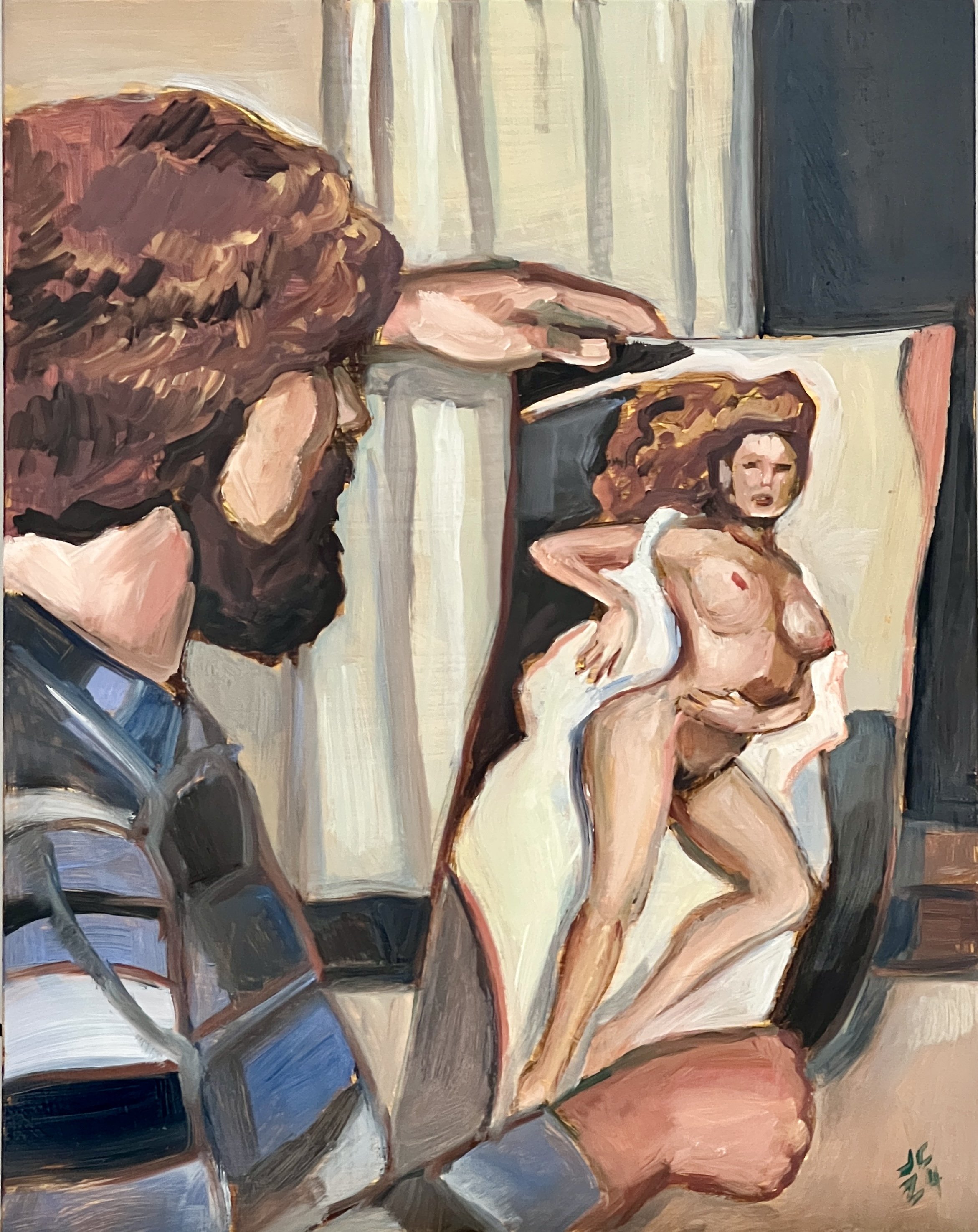
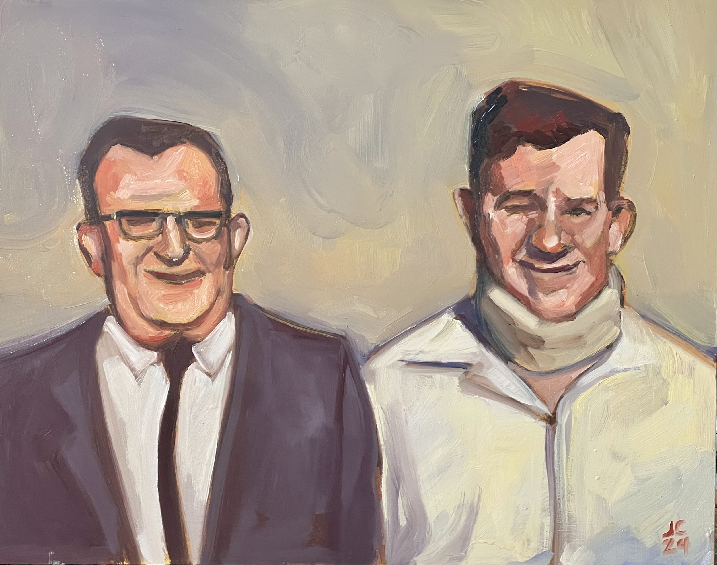
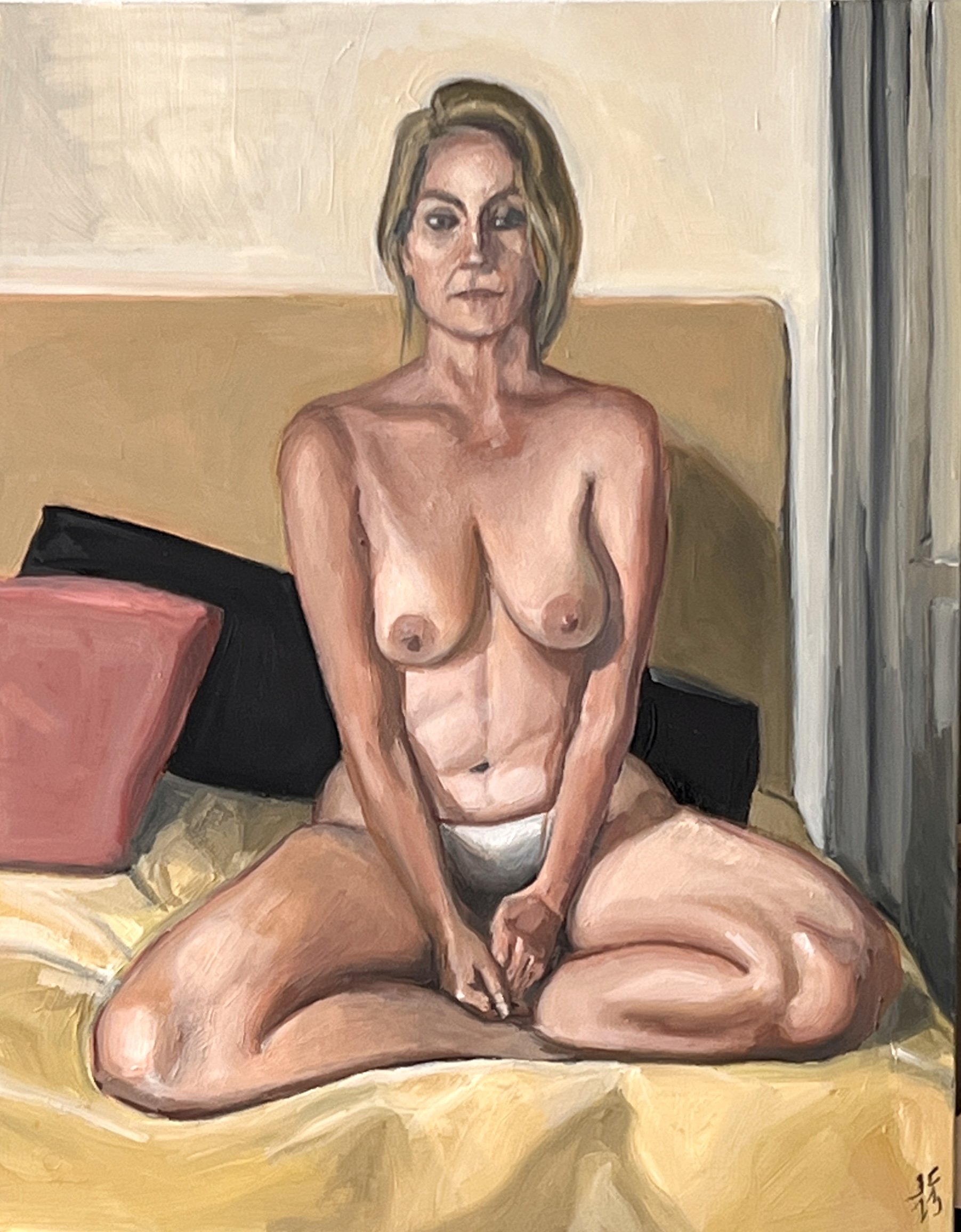
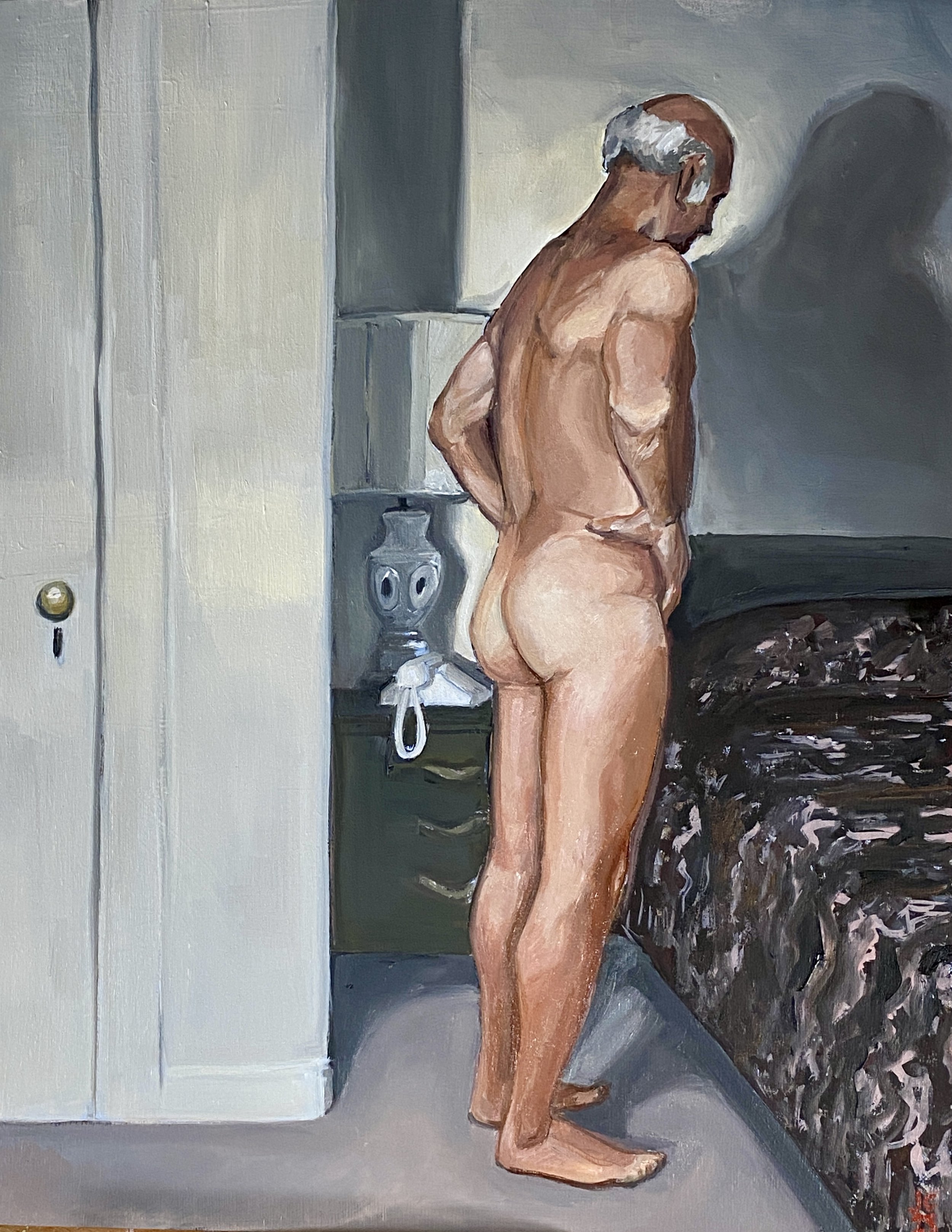
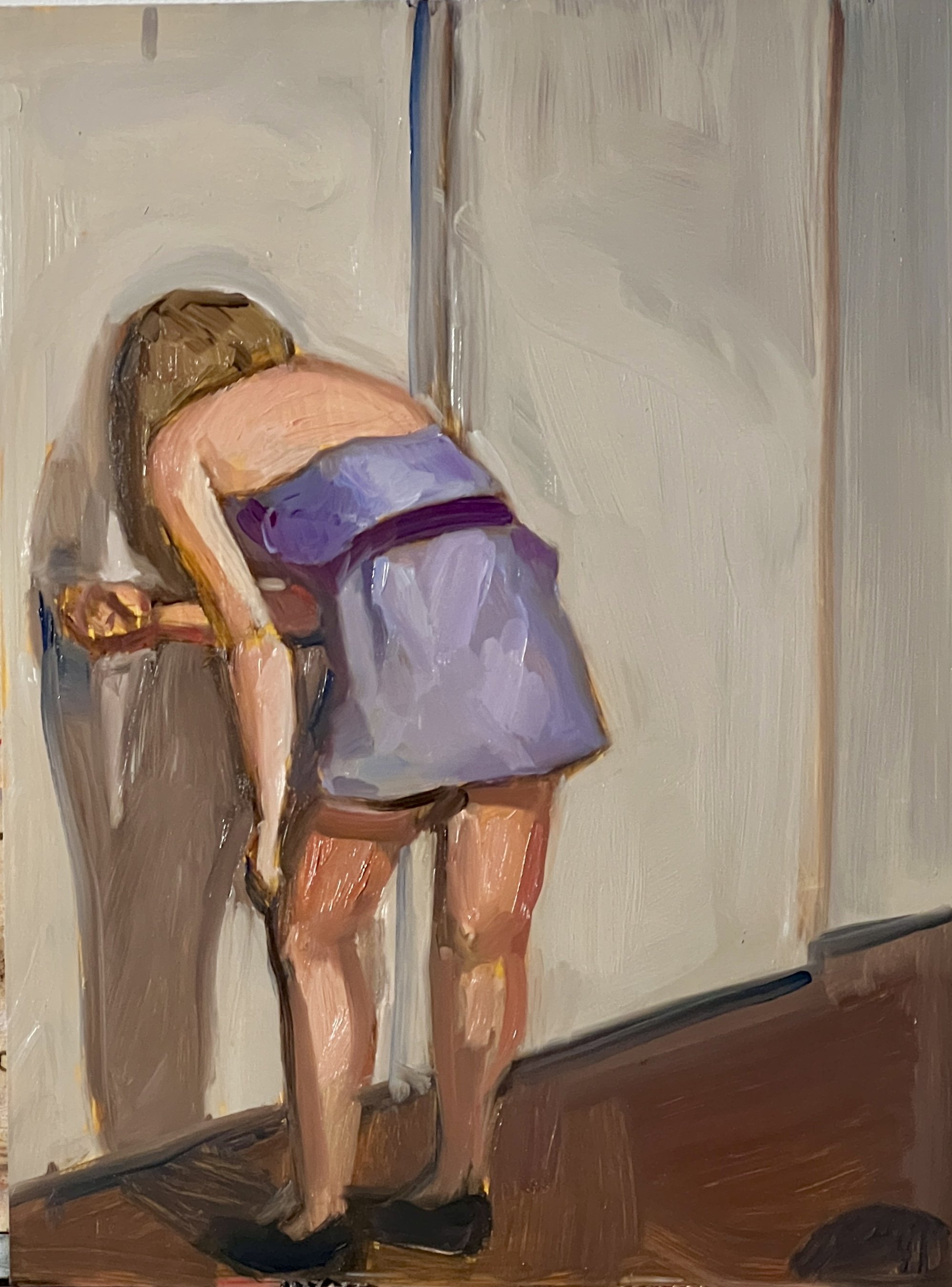
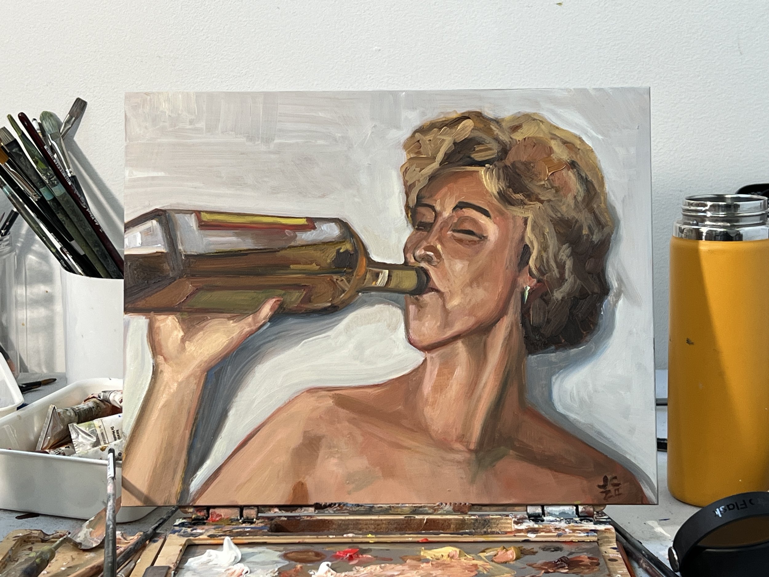
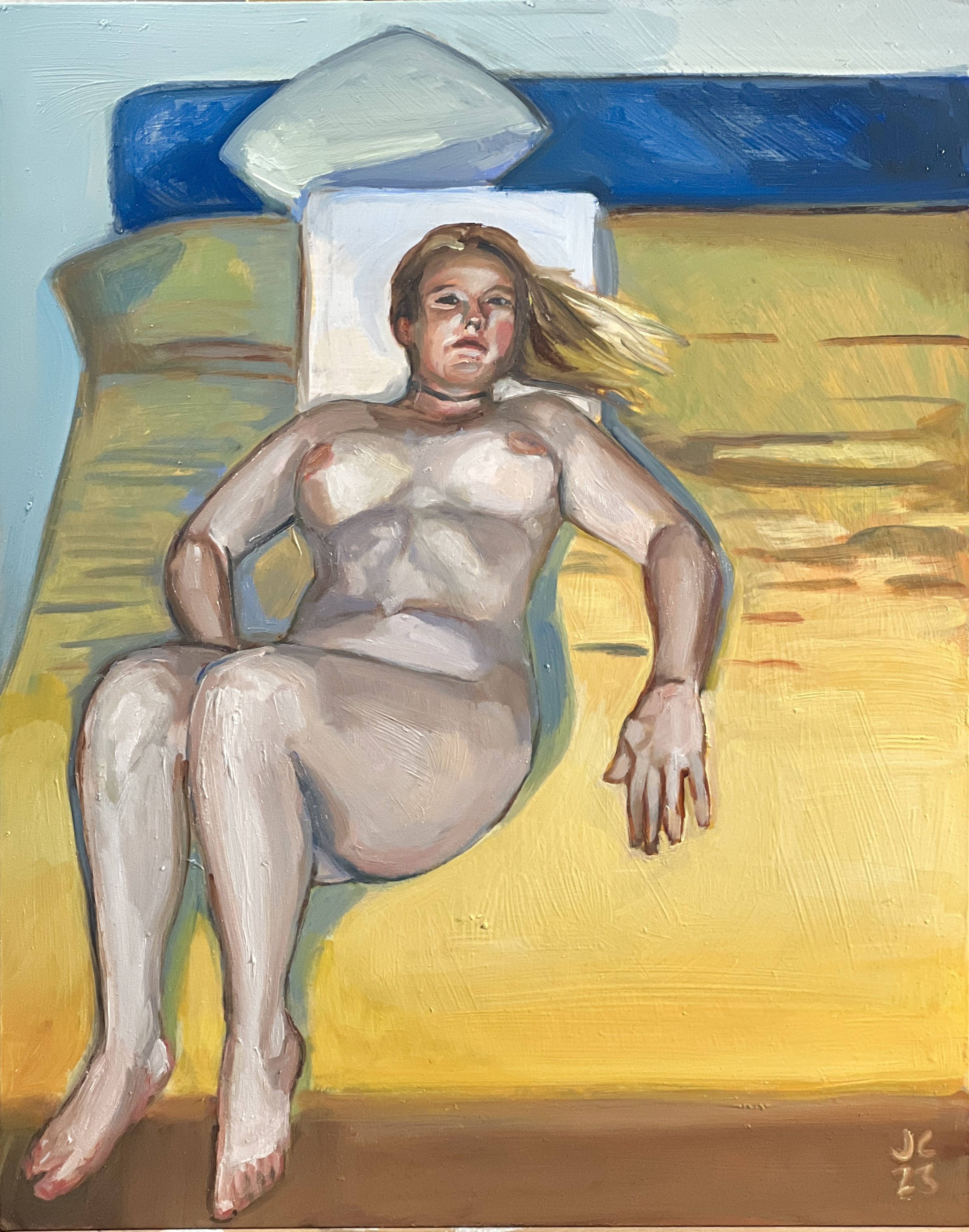
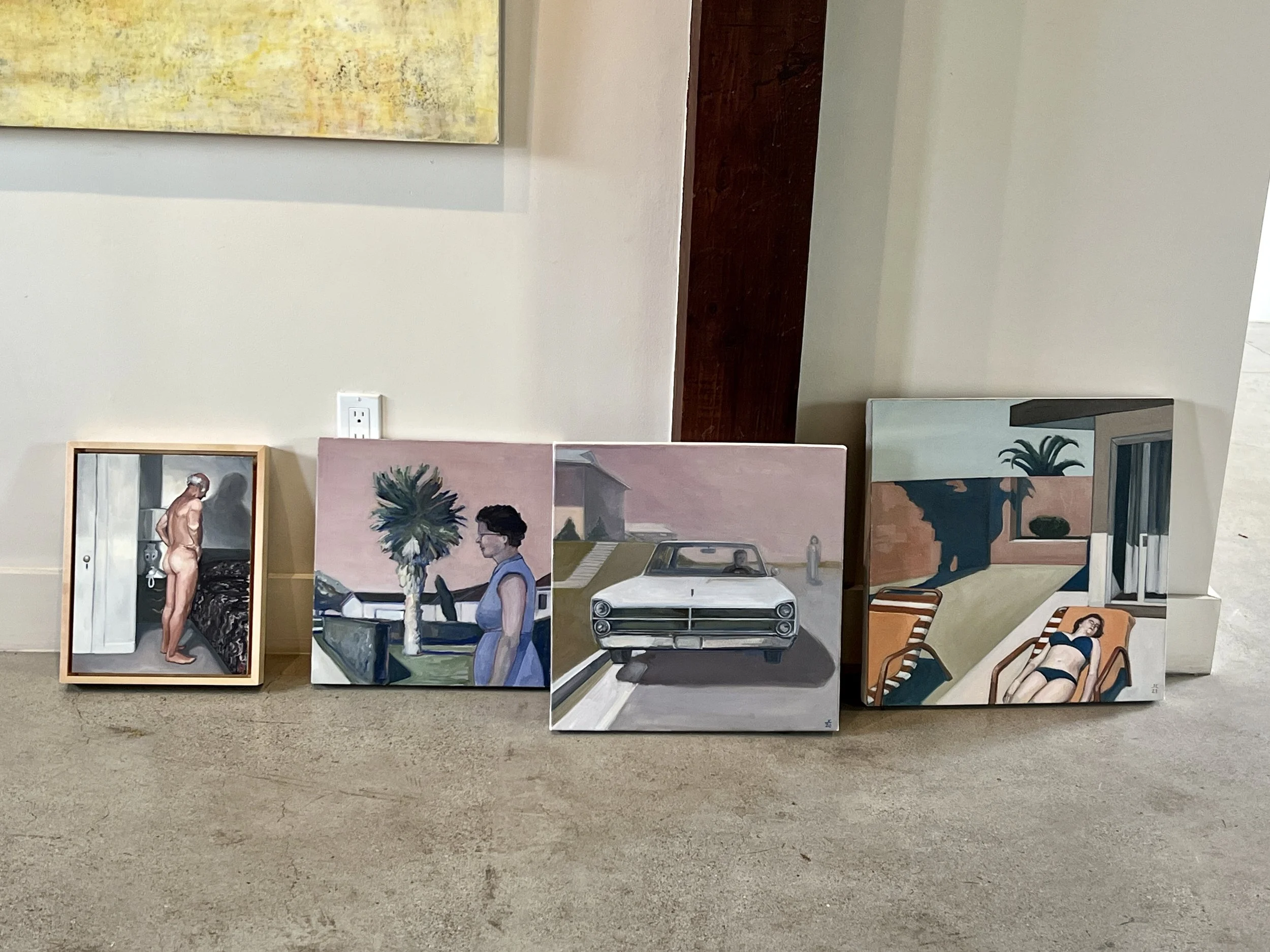
Here are all the paintings I've done in 2024
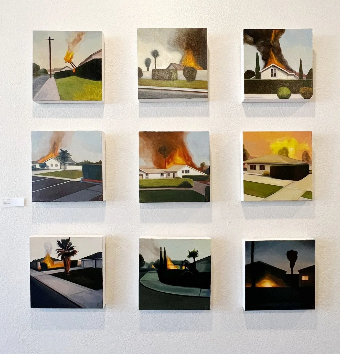
Recently, I’ve been knocking out a string of small oil paintings on gesso board. They’re all based on vintage snapshots. Singularly, each picture looks at the secret, libidinal lives of its subjects. But I think like a filmmaker. The combination and juxtaposition of these paintings together feel like pieces of a larger dialogue about the act of looking and being looked at. The voyeur and the uncomfortable object of desire.
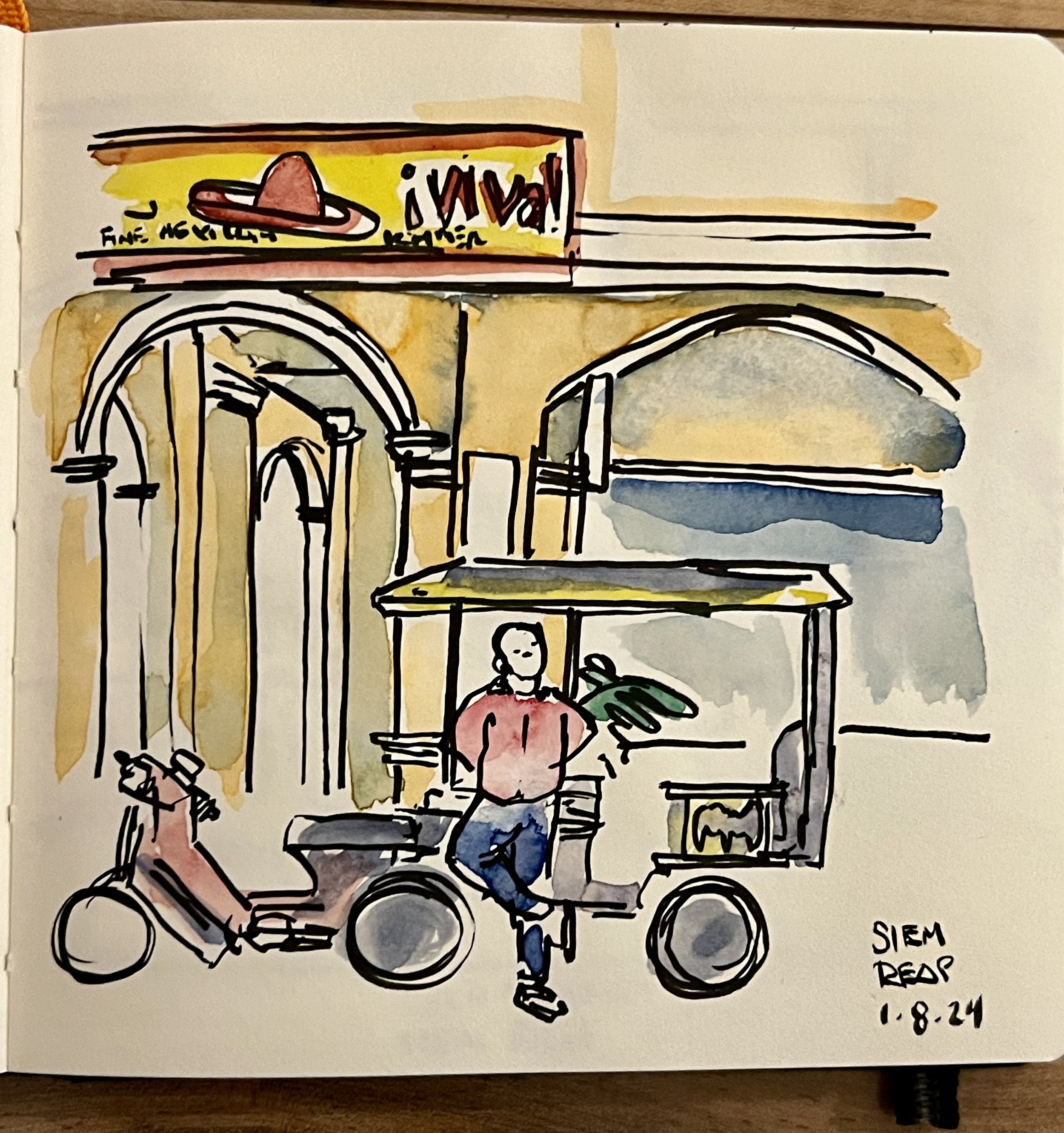
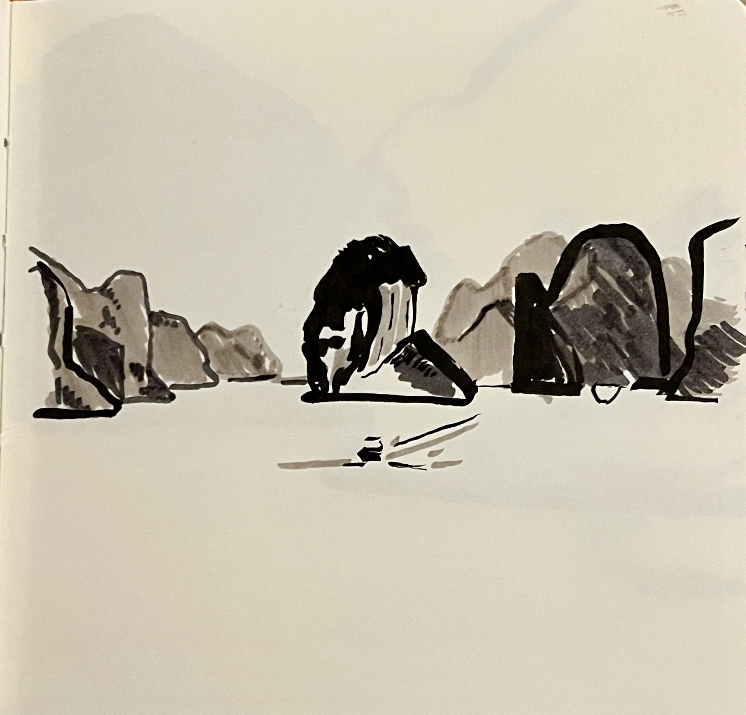
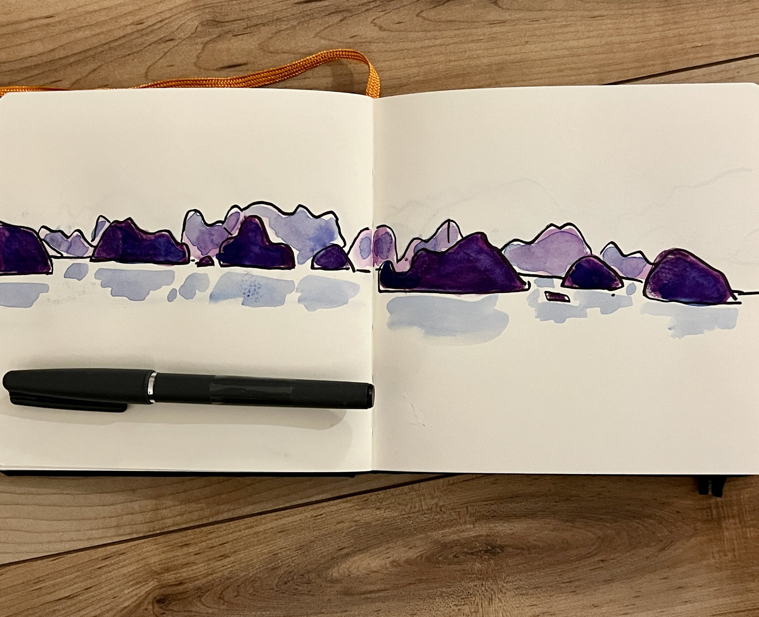
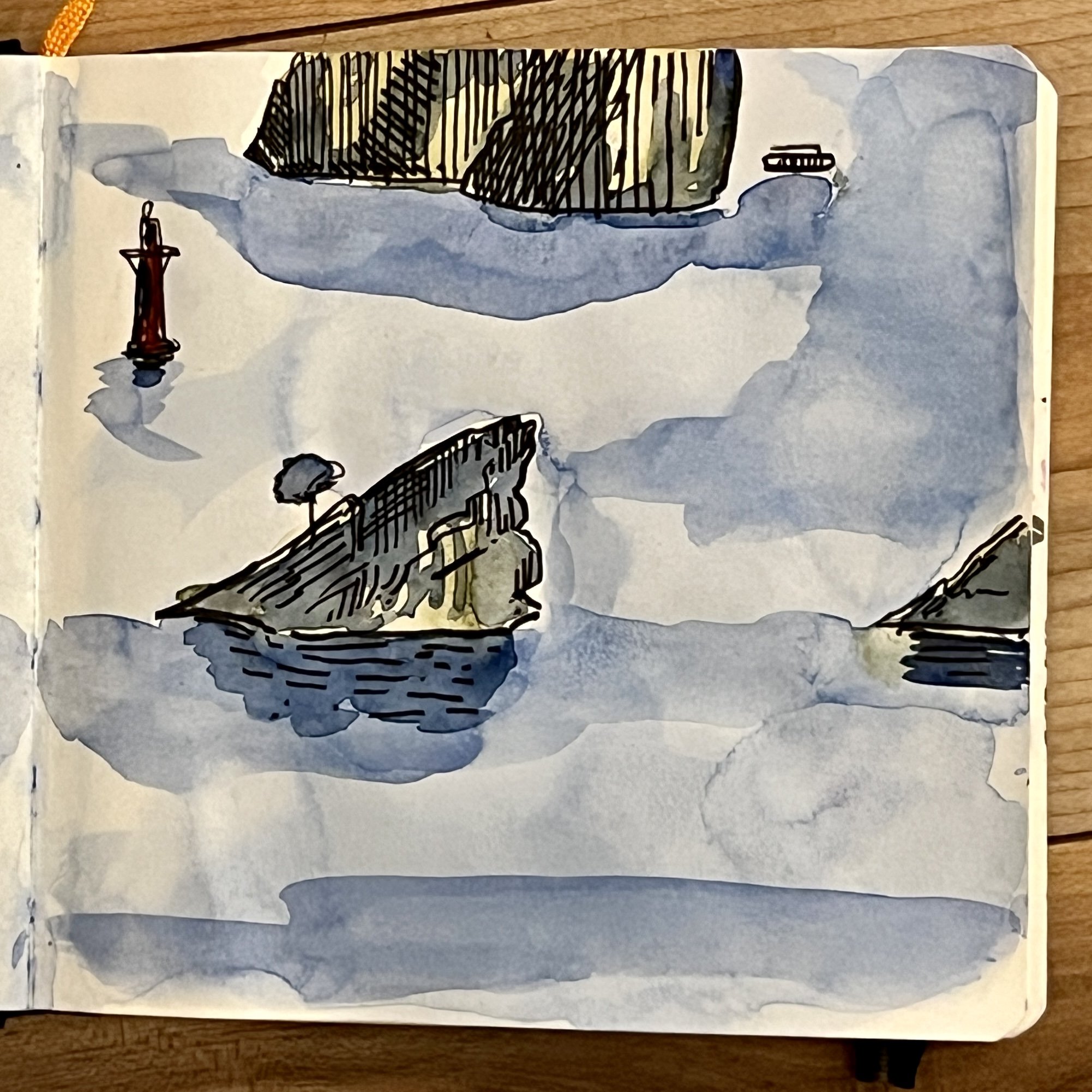
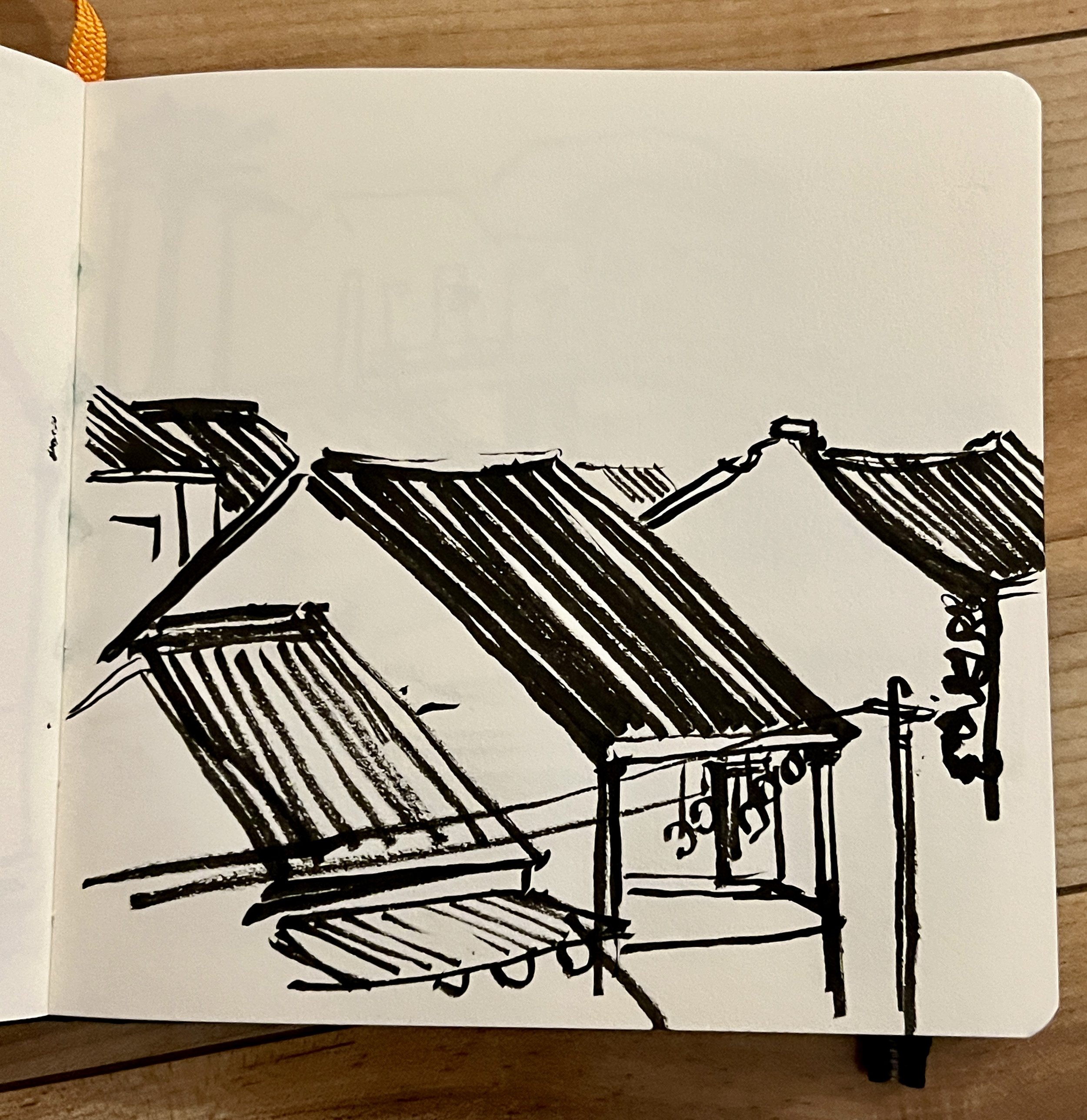
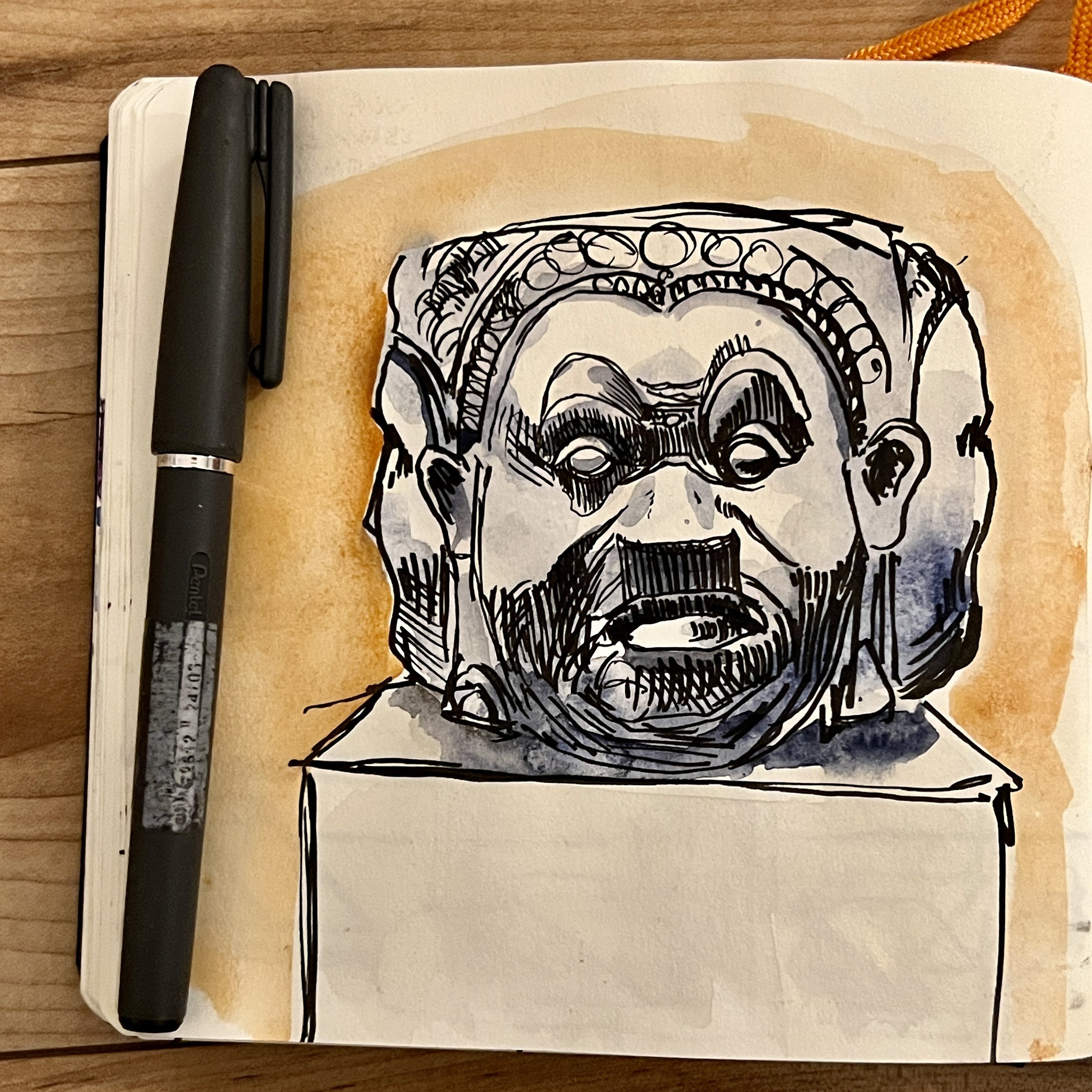
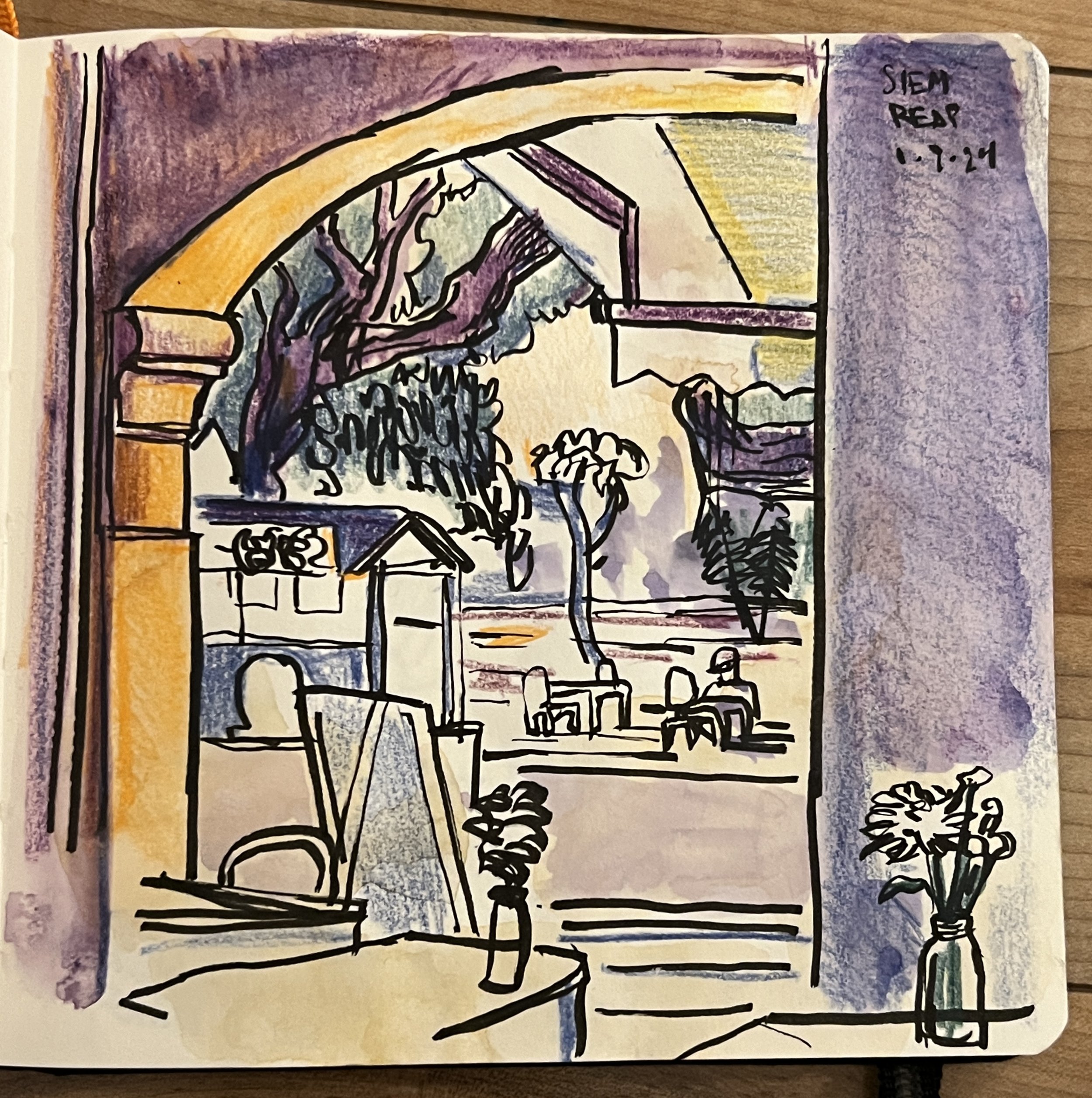
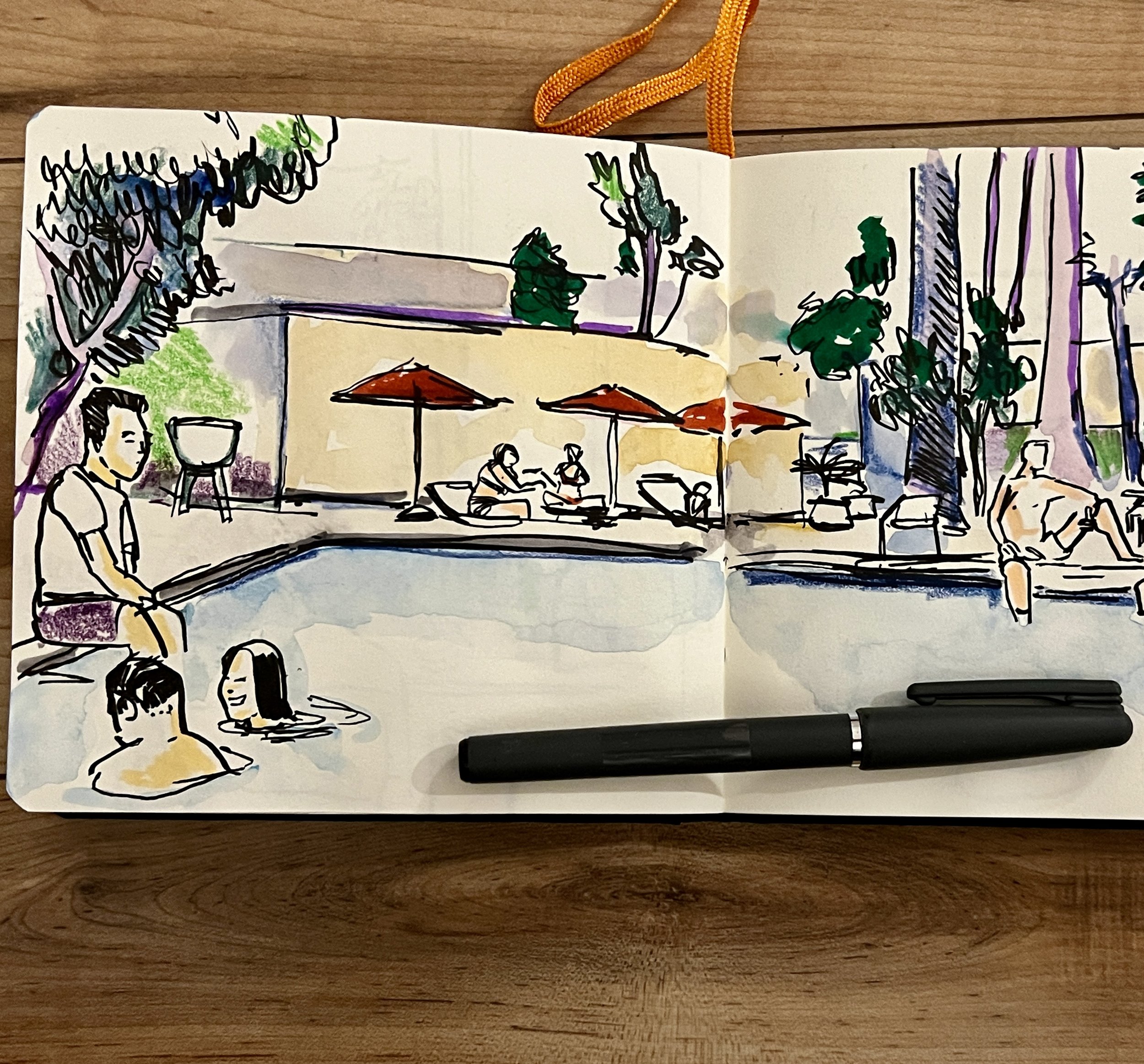
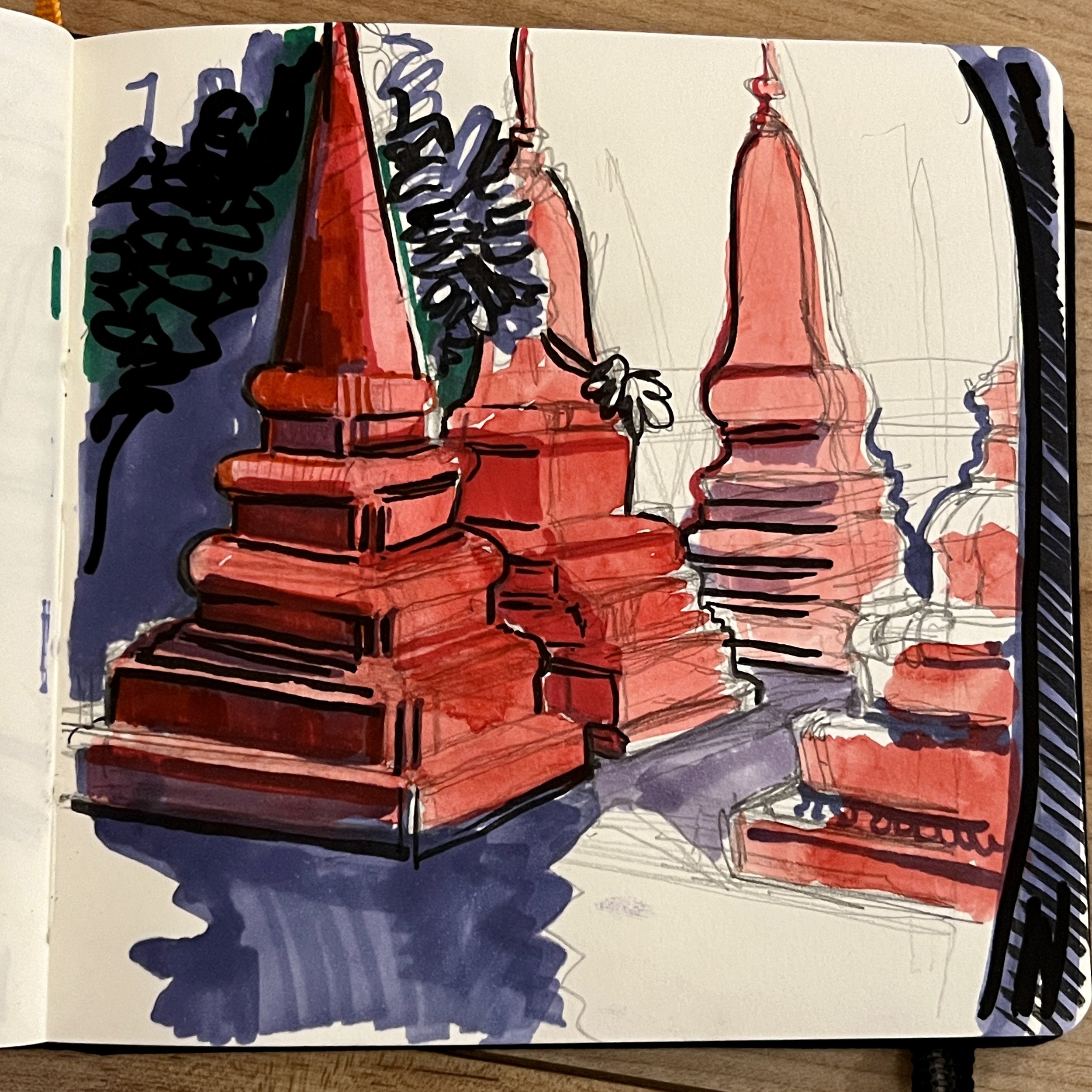
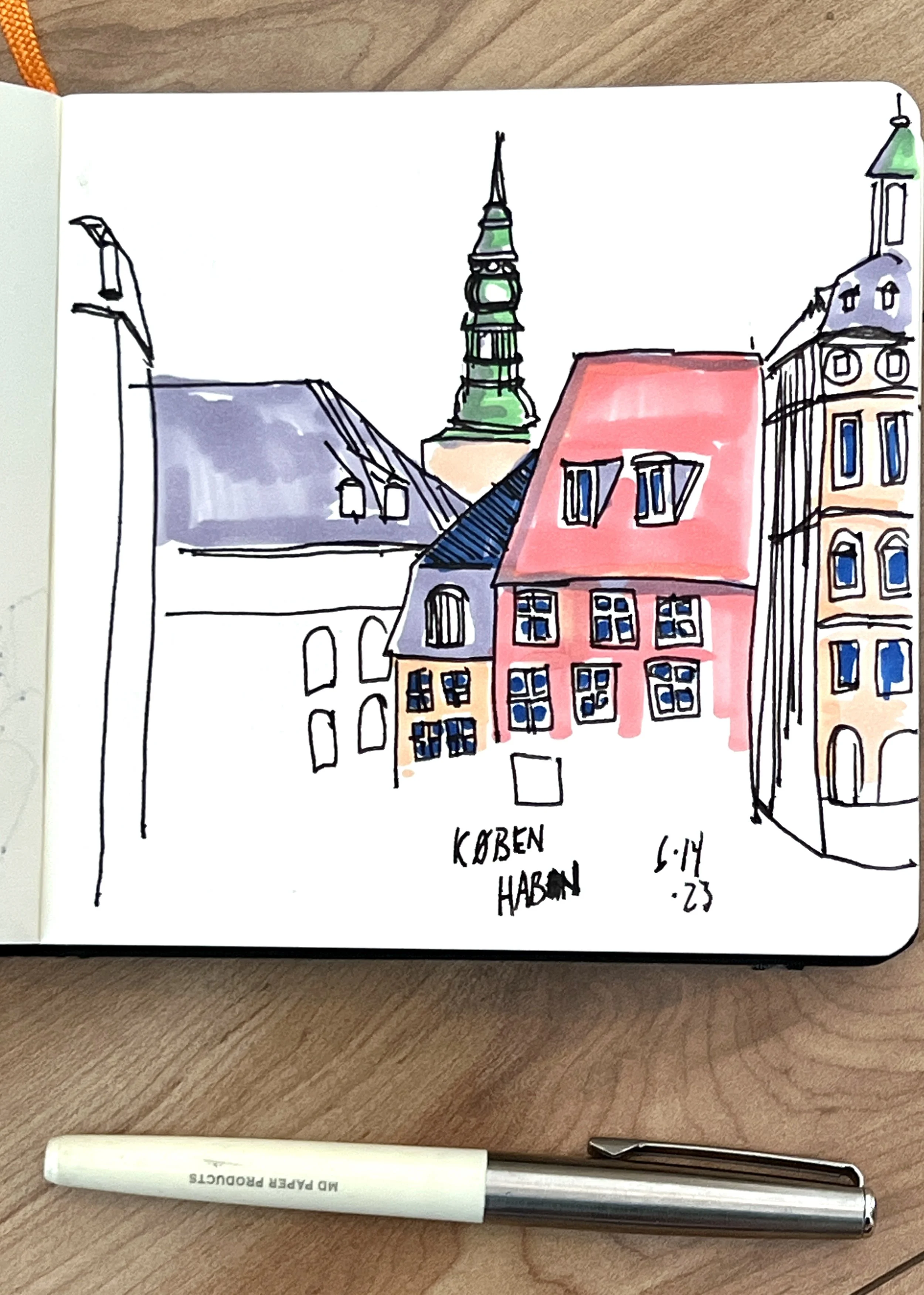
Sketchbook from my 2023/2024 Trip to Vietnam, Cambodia and Thailand
I just got back from a mind-blowing trip to South East Asia. If you want to hear all the details, buy me a beer and I’ll probably talk more about it than you’d care to hear. Highlights: Vietnamese food, Angkor Wat and Ha Long Bay.
When I travel, I like to keep a sketchbook on me. I’ll pull it out anytime I can and just start trying to capture the world around me. Below are a few of my drawings from that trip:
Reading By The Pool
Reading By the Pool is an incredibly sensuous painting. It is of a woman in a bikini sunning herself while reading a paperback. You can almost feel the heat and smell the cocoa butter in this picture.
For a lot of reasons, this work was a real pain in the neck. The angle of her jaw, the bend of her hand, and the oiliness of the skin all drove me crazy at some point or other but I’m pleased with the results. But what drove me most nuts, and the thing I'm happiest about, with this painting is its colors.
My process is wildly inefficient. After getting the underpainting sorted, I will play around with colors until something in the picture just start to gel. That might take 15 minutes or it might take weeks. I don’t understand it.
The blue of the bikini and the shadows came first. Then the green of the mat. Then finally, at the very end, greyish pink of the background.
I sold this painting earlier this year but prints of this work are available. A giant print of this painting would look amazing in your beach house in Key West or Kaui.
Check this work and a bunch of others over at the store.
Cheers
Jonathan

This Painting Gave Me Fits...
Here’s another favorite painting I did last year – Garden Wall. A woman in a translucent gown stands next to a backyard wall illuminated by some strong out-of-frame light.
For a lot of reasons, this painting drove me crazy. The lighting is unusual so it was tricky to get right. The color and the brick pattern on the wall absolutely gave me fits. Usually, a painting will take somewhere between one to three weeks to finish. This one took months. I set it aside for a spell and then returned to it later, which is something I rarely do. Every year, it seems, I have one painting that causes me grief. Garden Wall was that one for 2022 and I’m currently struggling to finish my 2023 pain-in-ass painting.
Ultimately, I feel Garden Wall’s long, painful gestation was worth it. Perhaps the feeling of anxiousness and longing for the painting benefitted from the months that I spent cursing at the canvas. Every time I look at this work, my eyes gravitate to the light hitting that gown (also a nightmare to paint). Something about it lends the painting an air of vulnerability.
Garden Wall is available over at my online store.

Extreme Colors on a Sunday Afternoon
This week, I’m focusing on one of my favorite paintings from 2021 – Sunday Afternoon.
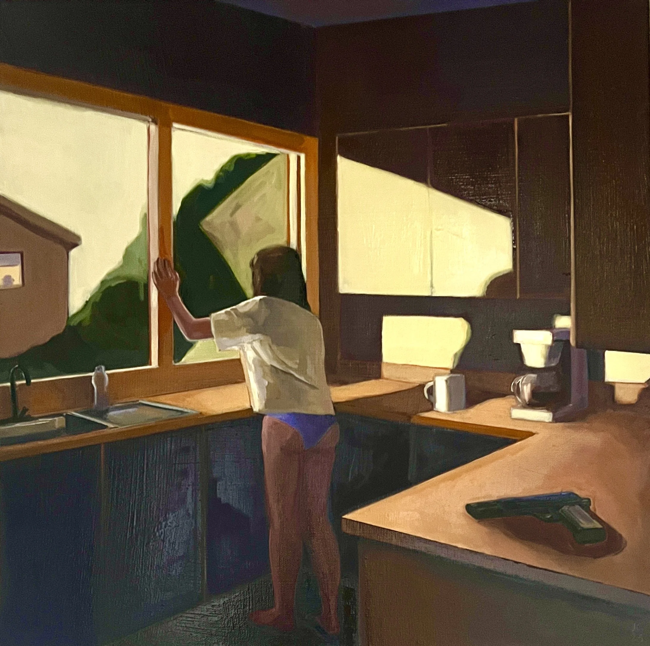
If last week’s painting – Dennis – recalls an Edward Hopper painting, this one looks a bit like a still from a Hitchcock movie imagined by David Hockney.
A woman in a blue bikini reclines on a chaise lounge while a large ominous shadow looms against the backyard wall. The sliding patio door behind her remains tantalizingly ajar. I'm not really sure what is going on here – I’ll let you imagine that – but Sunday Afternoon feels suggestive of a story.
What I really like about the work is my experimentation with color. Every painting I do ends up being a dialogue between two or three different colors. I try to predict what colors those colors will be when I start but more often than not, the painting has different ideas. A lot of my process is simply playing around with different shades of color until something magically gels. With this work, the painting apparently wanted to go with more extreme colors than usual. As soon as I used that peach-orange for the towels, the painting just started to work.
Anyway, Sunday Afternoon is in my online store here.
And, for the next two weeks, prints of the work will also be available here. Check it out.
Where Did My Pants Go?
This week’s painting is Dennis, which I completed earlier this year and which hung for much of the summer at Shoh Gallery in Berkeley. This is one of my favorite recent works. It has a vague feeling of loneliness to it that reminds me of an Edward Hopper painting.
As with a lot of my paintings, I found my inspiration for Dennis from a vintage photo. I bought the snapshot off of eBay. I liked its composition. When I received the picture, it came with a second snapshot that was clearly from the same photo session. That picture was much less evocative and much more direct – a full-frontal shot with a come-hither expression. I’m guessing that the pictures were part of a pre-Grindr hook-up ad printed in the back of some less-than-reputable periodical.
As a challenge, I decided to use the Zorn palette for this work, named after Swedish painter and William Taft portraitist Anders Zorn. The Zorn palette features only four pigments – ivory black, titanium white, cadmium red, and yellow ochre. Believe it or not, those are the only colors in painting. I learned a lot about mixing paints from making this.
This is one of my creepier paintings...
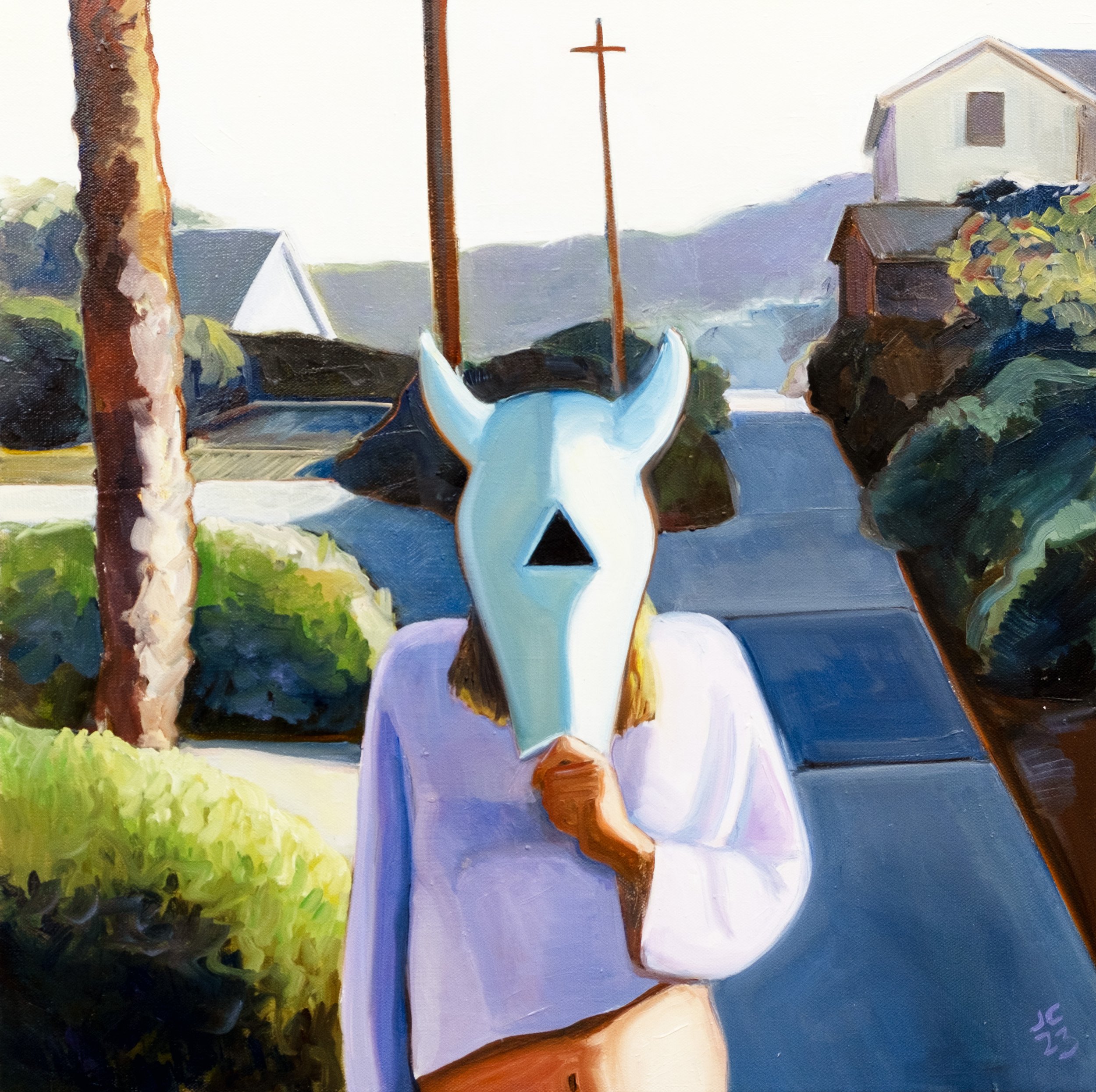
Hope everyone had a groovy Labor Day weekend. This week I want to focus on my 2023 painting Mask, which spent much of the summer hanging in the Triton Museum as a part of the Salon at Triton show.
Many of my paintings have a narrative quality to them. I have two degrees in film and when I’m not painting, I teach classes on cinema history. I suppose it’s not surprising then that my work can look like movie stills. Mask seems especially suggestive of an implied story.
A young woman in a crop top holds a mask to her face that looks a bit like a cow’s skull. Yet instead of the expected pair of round eyeholes, there is a triangle smack in the middle of the mask. She stands on a walking path in a sort of picturesque town that dot the California coast.
What is going on here? Is she a part of a cult? Is this a hallucination? I’ll let you be the judge of that.
Mask is now available at my online store, both the original and prints.
Ten Years of Veeptopus

Ten years ago this month, I started an insane project that inadvertently launched my art career: I drew portraits of every U.S. vice president with an octopus on his head.
The series started as a giddy, over-caffeinated idea that I took way too far. In July 2013, shortly after getting laid off from a grueling corporate job, a friend invited me to participate in the From Dusk til Drawn fundraiser at the Museum of Contemporary Art in Santa Barbara. Basically, it involved drawing for 24 straight hours. At that point in my life – i.e. before children – sleep deprivation was a novelty. It sounded insane. I was in.
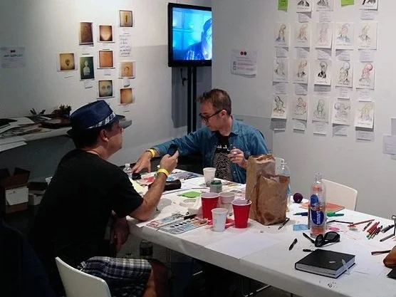
The artist at work.
The last thing I wanted was to be struggling to think of ideas of something to draw in the middle of the night. I needed to do a series, I thought. So after some debate, I decided to do portraits of all 47 vice presidents of the United States. Why? I don’t know.
I’ve always been quietly obsessed with the vice presidency. It is, after all, the fifth wheel of the Executive Branch. The constitution has little to say about the actual duties of the veep aside from presiding over the Senate and wondering about the president’s health. The wording of the Constitution was so vague that when William Henry Harrison died of pneumonia after a lengthy and ill-advised inaugural speech, it wasn’t immediately clear that his veep, John Tyler, would ascend to the presidency or serve under the title of “acting president.” The ambiguity wasn’t cleared up until 1967 with the ratification of the 25th Amendment.
Vice presidents were all ambitious men who could see the pinnacle of power but, save for a few, never quite got there. Instead, for much of American history, they were political afterthoughts -- ignored and forgotten. Woodrow Wilson’s wife and close advisors kept Thomas Marshall in the dark for 18 months about the president’s incapacitating stroke, thus denying him the presidency. FDR only met with Truman once before he died in the middle of WWII. And LBJ so relentlessly teased Hubert Humphrey during cabinet meetings that the veep reportedly broke down and cried. No wonder then that John Nance Garner, FDR’s first VP, said that the job wasn’t worth a “warm bucket of piss.”
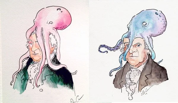
That night I ended up drawing 23 of the (then) 46 vice presidents. I hadn’t really drawn much since high school. Those first drawings were rough. When I got back home in Los Angeles, I vowed to complete the set. But then a funny thing happened: my drawing skills improved. My Truman was way better than my John Adams. I realized that I would need to redraw everything. And then when I got to Truman again, I realized I had to redraw all of them one more time. A few I had to redraw even more times. I never could get Al Gore right so I just put a tentacle over his face.
At that point, I decided to launch an Etsy store. To my surprise, people seemed to like my weird project. My work was featured on sites like Boing Boing, Buzzfeed, and The New York Times. That eventually led to me successfully funding a Kickstarter to make a Veeptopus Book.
It’s been a long crazy decade. I don’t really do octopuses anymore but you can buy the Veeptopus book, prints, and even a limited-edition poster.

The Signing of the Declaration of Independence sans Slave Owners
Happy belated 4th of July.
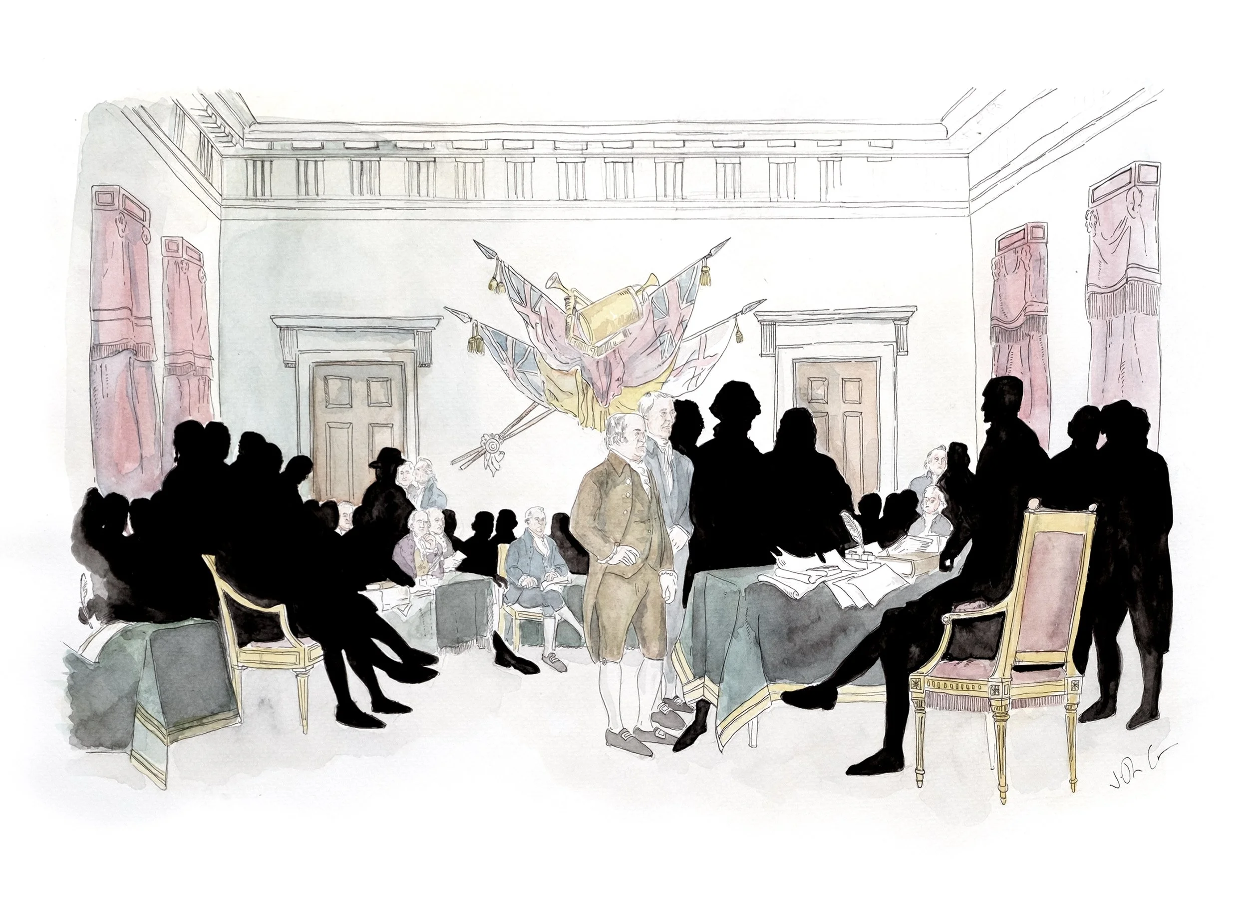
I just wanted to show you a drawing I did a few years ago of John Turnbell’s famous 1818 painting Declaration of Independence with all the slave owners removed. When I drew it, I went through the painting and to the best of my ability figured out who were slave owners and who were not. There are depressingly few people remaining in the picture, as you can see.
Prints are available for this work here on my online store.

I Have Two Paintings at this year's Salon at the Triton Museum.
While I was traveling, I learned that two of my paintings were selected to be a part of the Triton Museum’s annual art salon. This museum is located in Santa Clara, just down the street from me. I’ve applied to this salon in the past but I didn’t get in. I’m happy to get in this year.
For whatever reason, both paintings feel like stills from the same horror movie. Mask (above) shows a woman in a pink crop top putting an animal-skull like mask to her face. If the Cate Blanchett film Tar were shot in Santa Barbara instead of Berlin, it might look something like this.
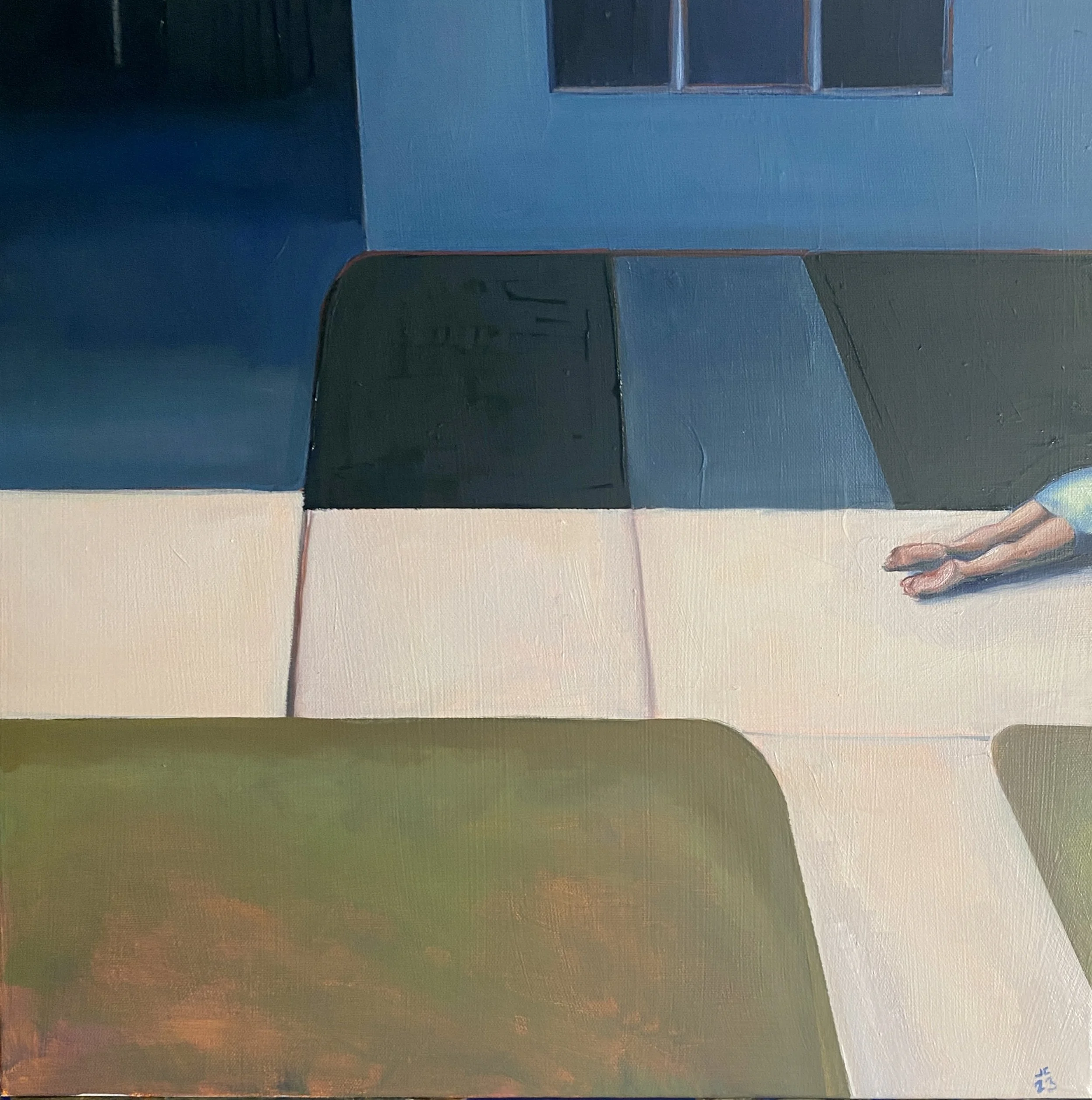
The second painting Sidewalk No. 1 (below) is, I suppose, another work in my “Corpse in Cul-de-sac” series. The prone body is there, though partially out of frame. The cul-de-sac is implied.
Anyway, the reception for the Salon at the Triton Museum of Art 2023 will be held on July 9th, 2023 from 2pm to 4pm. I’ll be there and I’d love to see you.
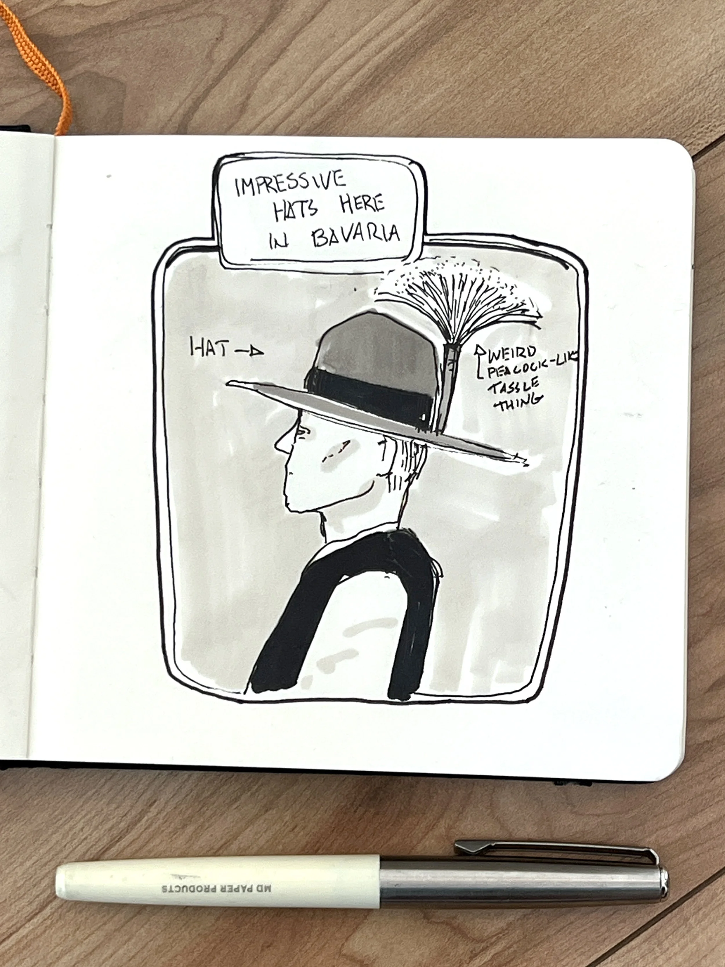
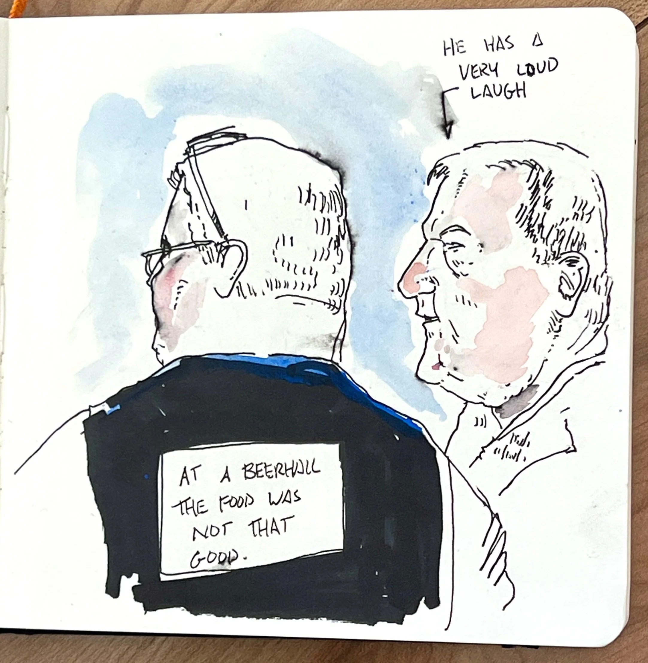
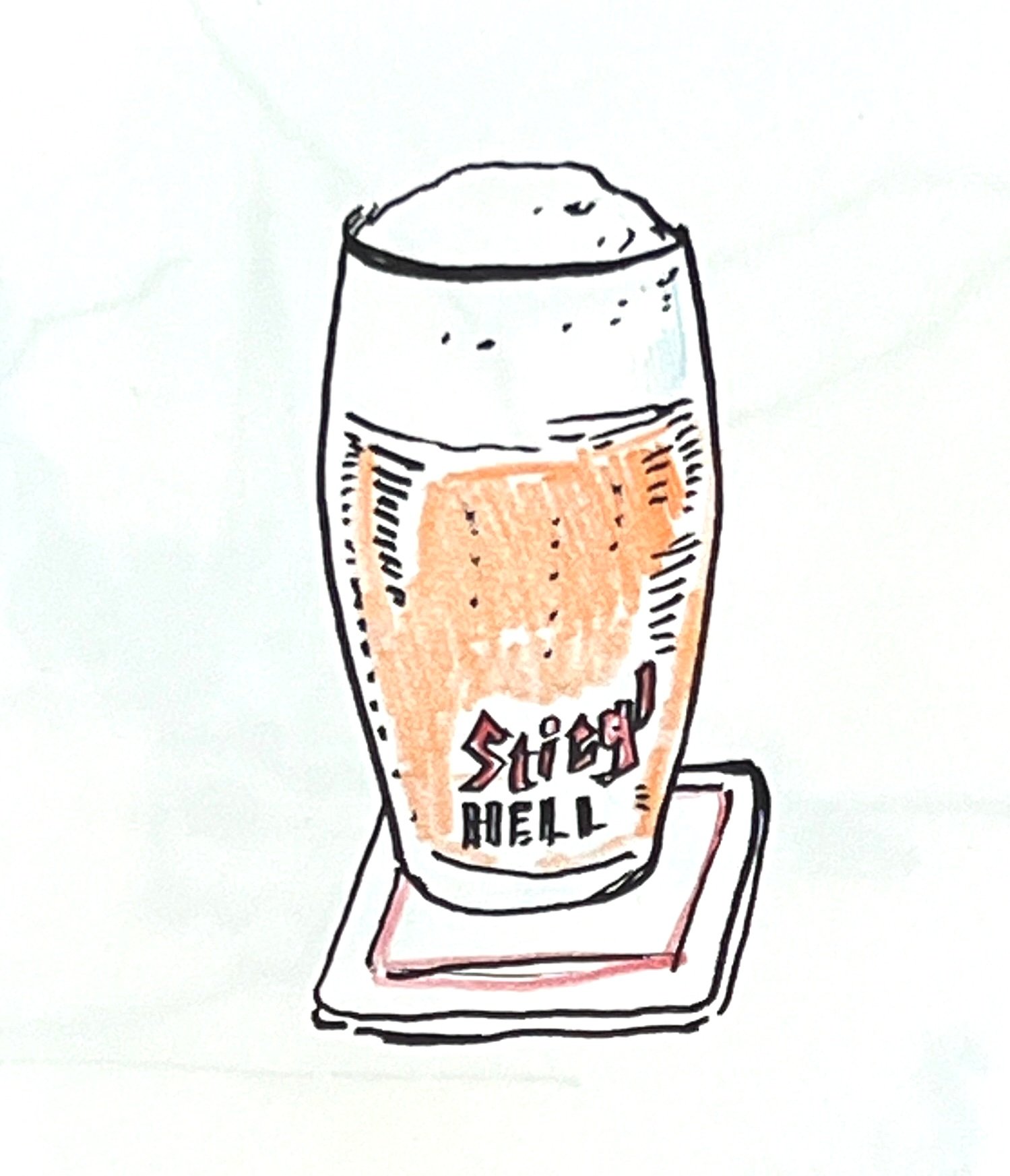
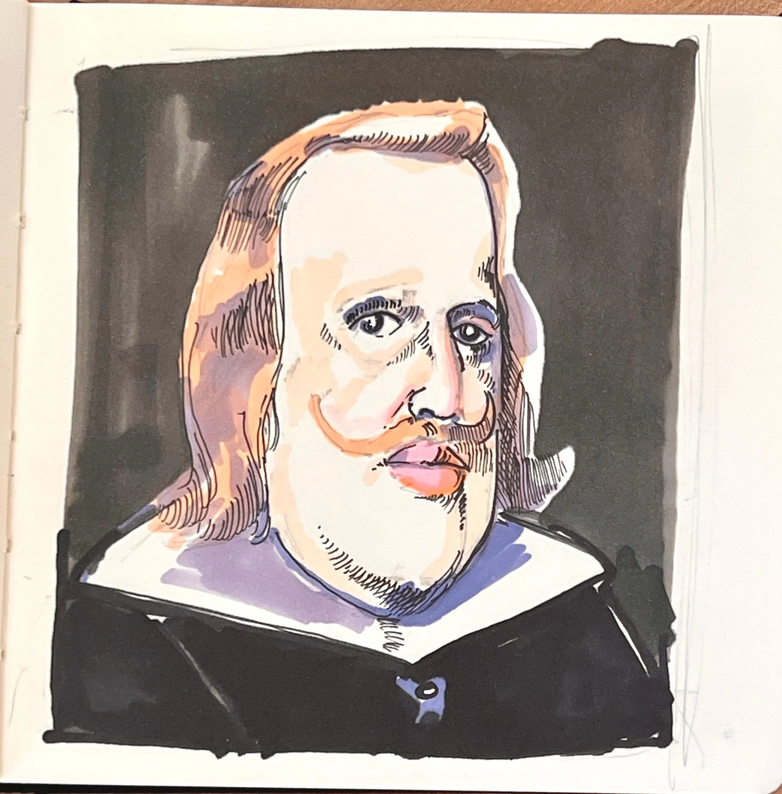
Sketckbook: Germany, Austria and Denmark
I just got back from a long-delayed trip to Germany, Austria, and Denmark. I lived in Salzburg for a spell as a child back during the Cold War and I hadn’t returned since. Austria was just as beautiful as I remembered. It was nice to return. We climbed an Alp, saw castles and some amazing art. And I drank WAY too much beer.
As I do with every trip I’ve been on lately, I kept a sketchbook. It’s a nice way to capture what I’m seeing and feeling when I’m there. Here are a couple of pages.
Pink Donuts and Unidentified Women Coming to a Gallery Near You
Hello everyone!
Summer is here. Though I’m taking a break from the art biz for a couple of weeks, I wanted to let you know about a couple of exhibitions I’m in next month.
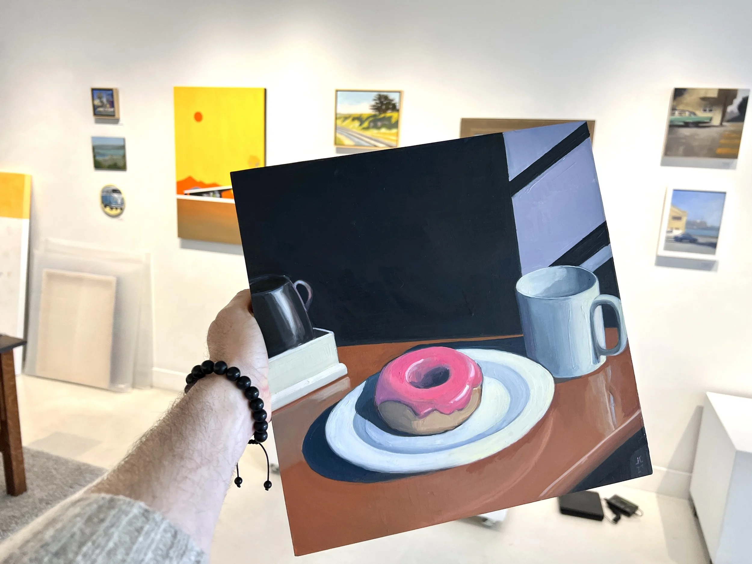
My painting Pink Donut is going to be a part of an upcoming “Delicious” show at Studio Gallery in San Francisco. This is one of my favorite works I’ve done this year. It came out looking like a still from an episode of Twin Peaks directed by Michael Mann. That show runs from June 8 - July 3, 2023.
Across the Bay, I’ll be showing four works over at Shoh Gallery in Berkeley for their Summer show, including Dennis, Phyllis, Unidentified Woman, and Sunday Afternoon. That show will run from the middle of June through to the middle of August. Stop by!
Cheers
Jonathan
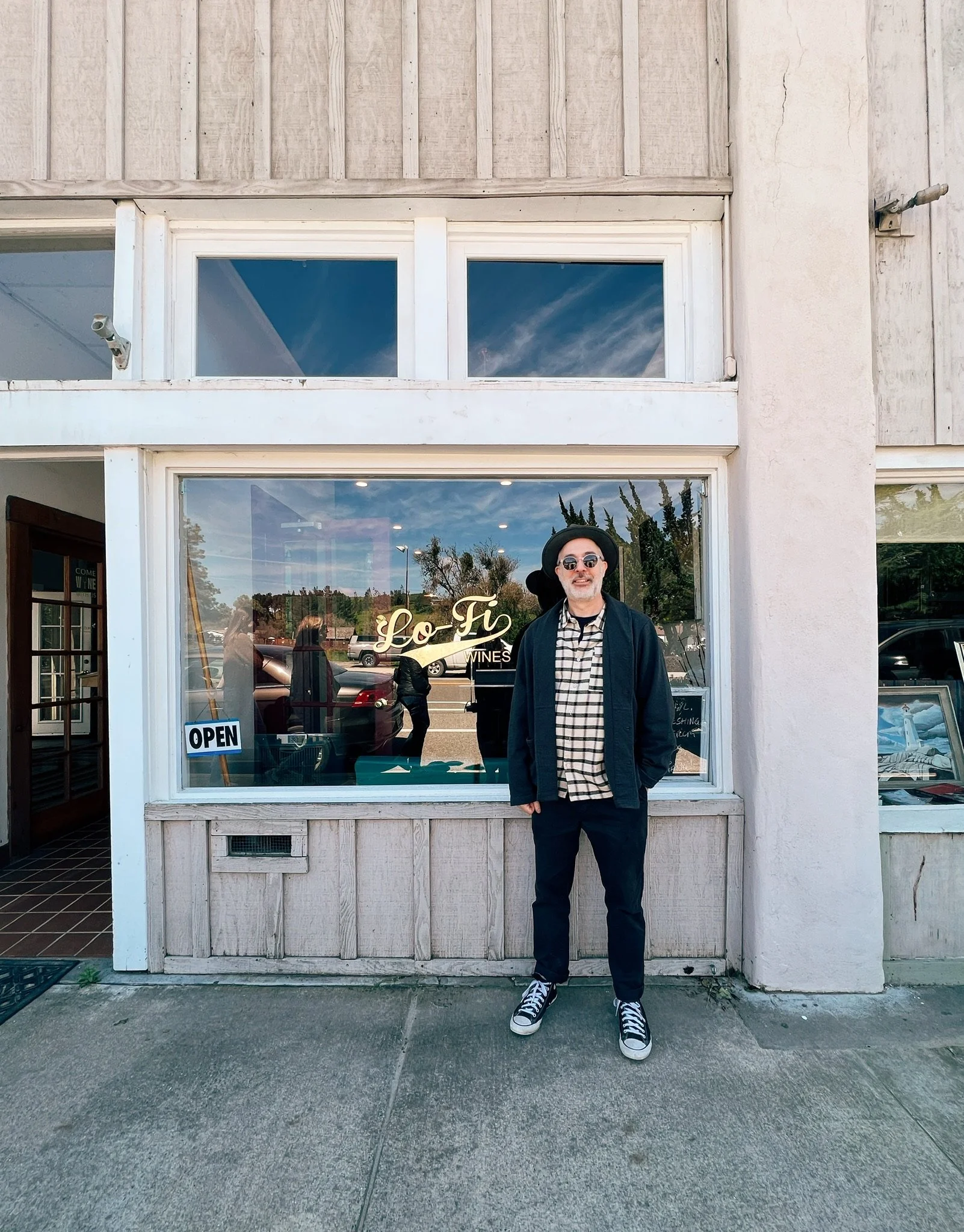
Just Hung Some of My Favorite Paintings in Santa Barbara Wine Country
This past weekend, I hung some of my favorite paintings at Lo-Fi Wines in Los Alamos in the heart of Santa Barbara wine country.
Last year during that dead week between Christmas and New Year's, we traveled there on the way to meet my in-laws in L.A. Los Alamos is a really cute small town and clusters around a single street. Our motel was on one side of the street and a couple of tasting rooms were on the other. The first place we visited had some pretty good wine. The place was filled with antiques and the owner seemed very keen on lecturing us about the joys of the mandolin. We bought a Chardonnay but didn’t stick around.
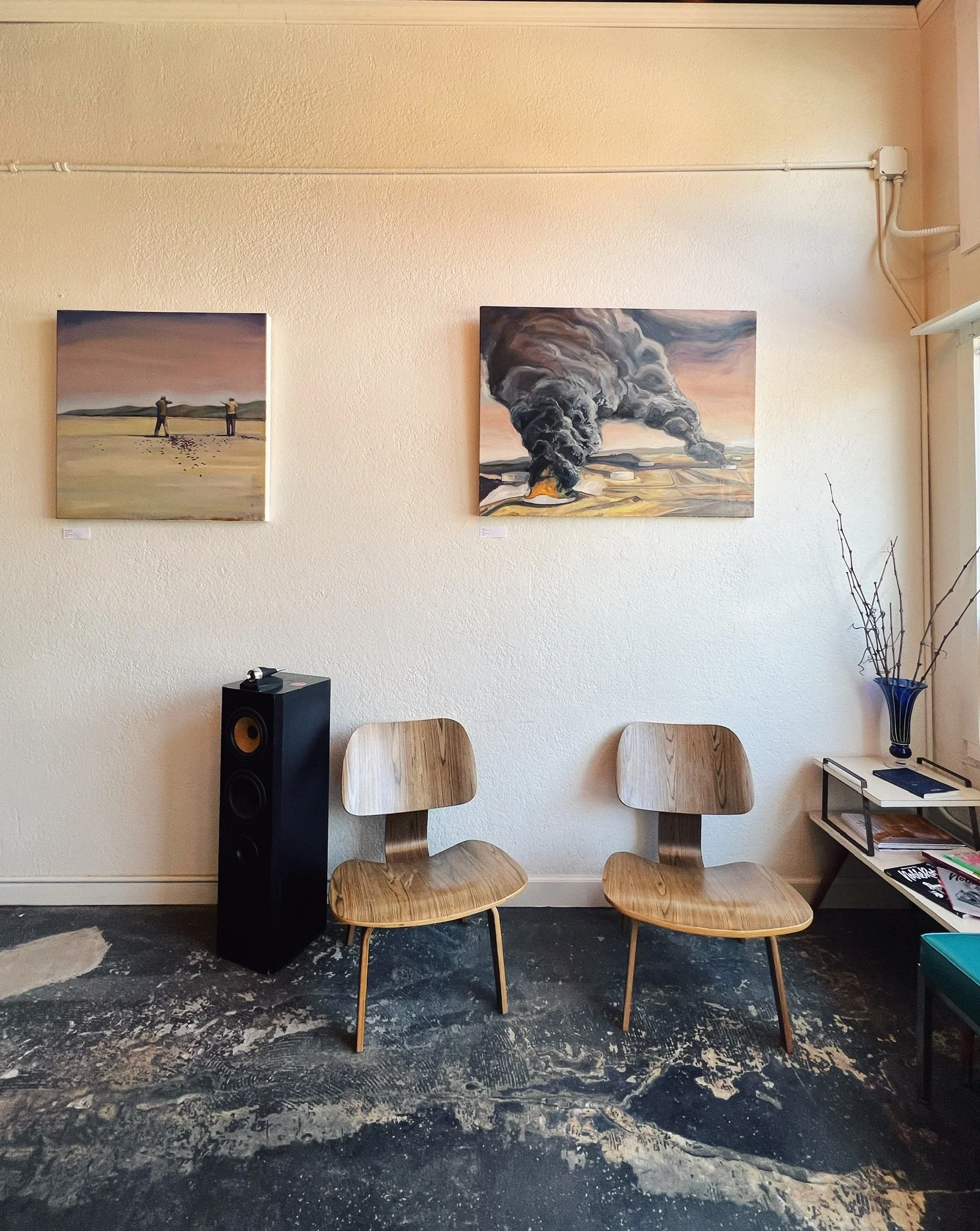
The next place we went to was Lo-Fi. The place was decorated with mid-century furniture and boomerang linoleum. Tribe Called Quest was playing on a turntable. I felt at home. During the tasting, I asked about the paintings on the wall which were a series of splashy abstracts. Craig, the co-owners, said that he was looking to change up the art as he poured me a Malbec with a spicy finish. We exchanged emails.
The paintings I selected for Lo-Fi were all fire-themed, including my House Fire series, my Oil Fire series, and my large oil field painting that I wrote about earlier, Metaphor. I also hung a couple of prints from my online store including Cul de Sac and Golden State Dr.
Anyway, stop by. Drink some wine. Take a gander at my work.
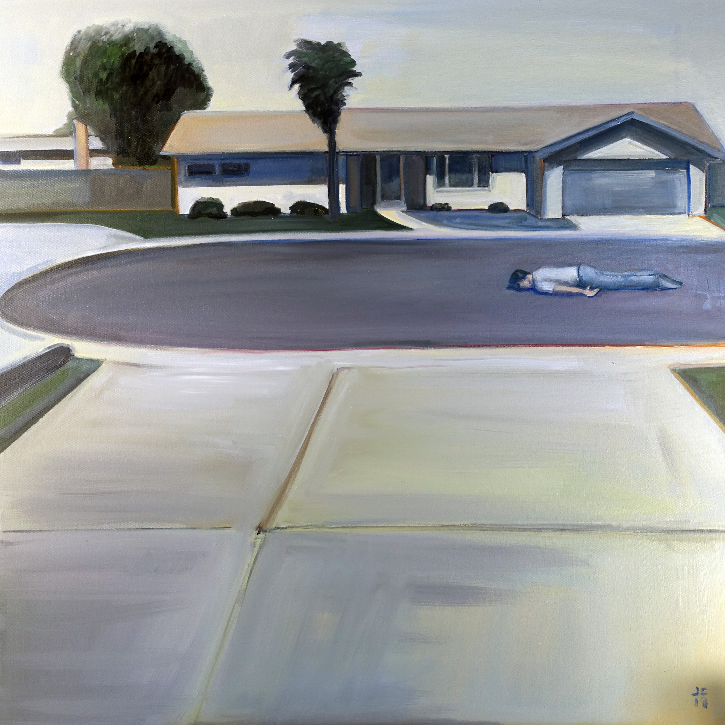
Dead? Tired? Or Just Crushed By The Weight Of The American Dream? You Be The Judge.
Some guy is facedown in a suburban cul-de-sac. Is he dead? Tired? Or just weighed down by the crushing weight of the American dream? You be the judge. I think that Cul-de-Sac is my first successful painting because it defies ready explanations and evokes a mood that doesn’t resolve easily into words.
My reference photo for this was an old snapshot of a bicycle at the end of a suburban driveway. What drew me to the image was the shape of the cul-de-sac and the bland California ranch house on the opposite side of the street. It reminded me of my grandfather’s house in San Diego.
Yet I didn’t want to paint the bicycle. It was a boring subject that also looked like a royal pain in the neck to paint. What to put in its place? The idea of a guy in repose came in a flash and I just ran with it.
BTW... don't forget to check out my new site and enter to win a free print of this image while you're there: https://www.jonathancrowart.com/new-website-giveaway

Giving Away A Print To Celebrate My New Website
Great news! I've been working hard to expand my art business and have just launched a brand new art gallery website. I'm celebrating with a giveaway and a special launch promotion. Details below.
www.jonathancrowart.com is the online store for my artwork. Or just hit the “Store” tab on this site. There, you'll find all of my available originals, as well as prints.
I'm so excited to take this next step with my art business, thanks to the support of my followers and collectors like you. So here's my way of saying "thanks" for keeping up with my art:
To celebrate, I'm giving away a 16x16 print on watercolor paper of my painting Cul-de-Sac, worth over $100.
I also have a special prize for EVERYONE who enters, EVEN IF YOU DON'T WIN:
As soon as the giveaway ends, I will give you a one-time discount to buy anything on my site at 20% OFF.
Wild Neon Oil Painting I Made While At Chalk Hill Artist Residency
For a while there, I’ve been trying to push myself to get wilder, more expressionistic with color. While at Chalk Hill, I decided to go for broke. Using some neon-colored oil paint, I tried to strike a balance between reckless color choices and a still somewhat realistic depiction of the landscape.
The setting is the driveway in front of the house where I stayed. That window in the background is the window to my studio. During my time there, I would spend days where I would be on my own in this vast, beautiful land. I would barely talk to anyone all day. It was bliss. And I probably went a bit feral. This painting captured some of my state of mind while I was there.

Still Lifes I Made While at the Chalk Hill Artist Residency
The house I stayed in was filled with tchotchke from the 1960s. There were posters of Cream and the Grateful Dead that lit up under black light. (Rumor has it that the Grateful Dead actually stayed for a spell in the house where I lived.) Posters from Bay Area natural food stores. And lots of brightly colored, mid-century dishes and ashtrays. There were too many cool, colorful things there not to paint. So I put on my Wayne Thiebaud hat and went to town.


Mixed Media Landscape I Made During My Stint at the Chalk Hill Artist Residency
When I went to Chalk Hill Artist Residency, deep in the wilds of Sonoma county, I had no clear idea what I was going to do. I had a vague notion of doing some Plein art painting but nothing firm. I brought up a lot of random things from my studio like watercolor paper, canvases, colored pencils, and oil paint. Stuff I might need, just in case. I wanted to be prepared for whenever inspiration struck.
In my first few days, I did some sketching and a couple of studies. Nothing too involved. I decompressed. I went on some hikes. I waded into the Russian River. Explored Santa Rosa a bit. Then I started doing some still lifes, which I will post a bit later.
The second week, I picked up this fancy Japanese ink nib. and immediately started sketching the beautiful landscape that was literally out the window of my studio. This inspired me to go bigger. So I pulled out some large sheets of watercolor paper that I brought with me.

I had been really looking at the works of Richard Diebenkorn while I was there. I loved the tension in his work between representation and abstraction, especially in his landscape. Nature is beautiful but it’s also chaos. The trick of the landscape painter is to break down that chaos into some kind of order. Diebenkorn often used roads – clear lines slashed through a vista – as a handle to structure his paintings. I decided to do some of the same.
So I started working first with just pen and ink but then later experimenting with gouache and I was rather pleased with the results. You can see all of the landscapes I did then here. Or here.
I looking forward to exploring more in this direction.

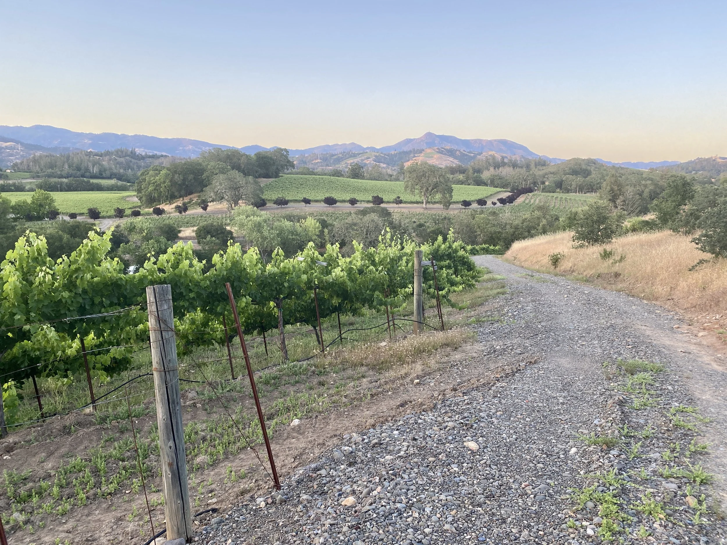
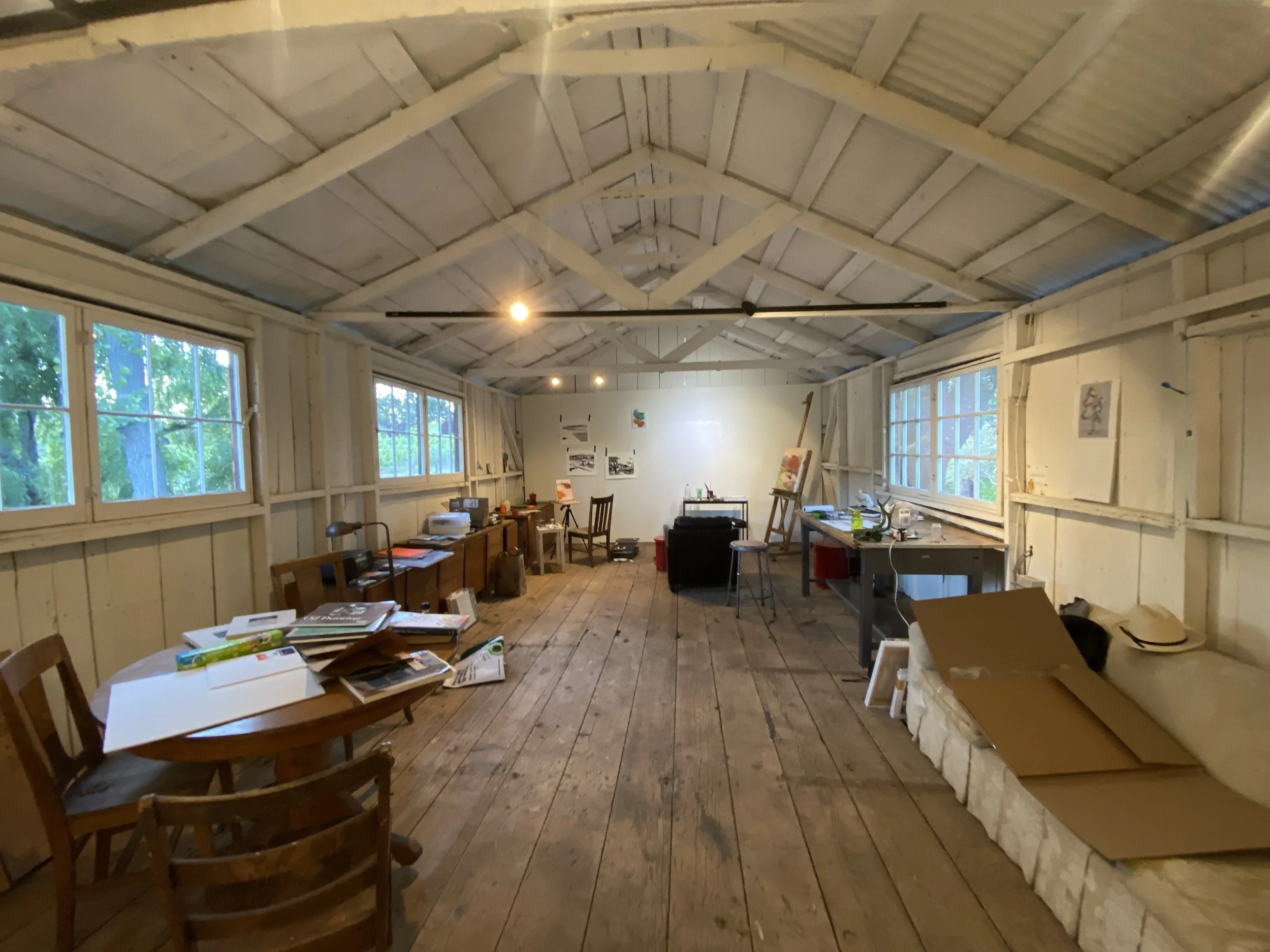
I Just Wrapped Up 2 Weeks at the Chalk Hill Artist Residency
For the past two weeks, I’ve been living on a 175-acre winery deep in the wilds of Sonoma county as a part of the Chalk Hill Artist Residency.
Since I learned I was selected to be one of 16 artists to participate this year, I’ve been really excited and nervous about this opportunity. I really haven’t had the time or space to just focus on art since I was in film school 20 years ago. I didn't want to screw this chance.
I got back Monday and I'm still mentally unpacking my time there. I lived in a hundred-year-old farmhouse filled with books and 1960s tchotchke yet was lacking an internet connection. (This proved to be more a benefit than a problem.) I had a huge goat barn-turned-studio to work in. And I had the stunning beauty of California wine country to inspire me.
Though I had plenty of opportunities to laze around and drink some of the local wine, I found that working in my studio in a focused and sustained way was far more fun than anything else. I produced seven oil paintings and six mixed-media landscapes.
I'll share the art I produced soon.